When designing the Kickstarter project page for Scythe, I reached an impasse with a specific component that words and pictures simply couldn’t describe. I groaned inwardly, as I knew the time had come. The Time for GIF.
In general, I’m really not a fan of constantly moving graphics on a computer screen. If there’s a banner add or an autoplay video out of the corner of my eye, I’m distracted from the content I’m there to consume. Those moving images catch my attention, but not in a good way.
However, I’ve seen a few Kickstarter creators use GIFs in effective ways. GIFs are moving images. I have no idea how they work, because they’re not videos you can play or pause. They’re just short, endless, moving images.
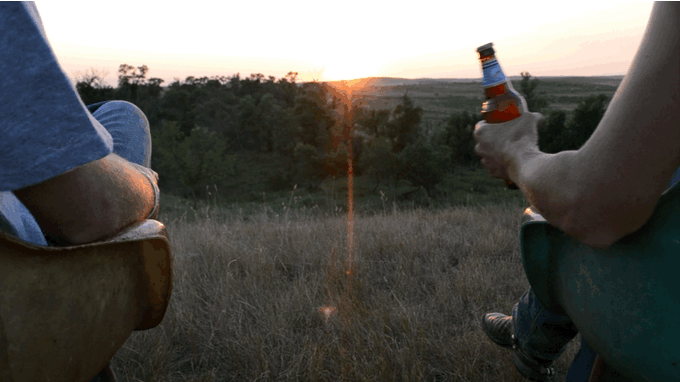
The first project on which I saw a GIF and thought, “Oh, that was helpful” was the Beer Hammer. It’s a project for a wooden mallet that opens beer bottles (normally you don’t have to click on a GIF to see it, but that appears to be the case here and in the second example):
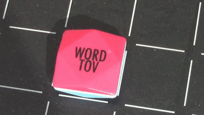
A few months later, I saw another project with a useful GIF. This time it was for a Scrabble-like game called WordTov that had some uniquely shaped tiles. As soon as you wonder why they’re shaped this way, you’re presented with this GIF that explains everything:
The key to both of these examples is that the GIF helped to explain a very specific, potentially confusing aspect of the project in a way that neither text nor a static image could.
This brings us back to Scythe.
In the Scythe Collector’s Edition, there is a board extension that slides next to the back of the game board to increase the size of the board by 50%. The content is the same–just bigger.
Confused? You’re not alone. Everyone to whom I’ve tried to explain the board extension doesn’t understand the concept. It’s difficult to explain in text and in static images, so I turned to video creator Bryce Walter to create a GIF of the concept:
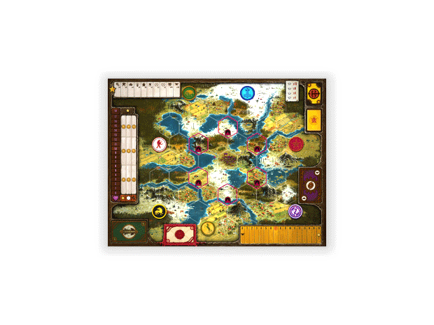
It’s one of the few times when I think the endlessly moving image is actually helpful, because you may have to watch it a few times to understand what you’re seeing. At least, I hope you understand now–it’s final!
Can you think of other examples of Kickstarter projects to effectively convey a key piece of information via a GIF–something that could not have been expressed better in any other format?
36 Comments on “Kickstarter Lesson #162: When to Use a GIF Instead of a Static Image”
Leave a Comment
If you ask a question about a specific card or ability, please type the exact text in your comment to help facilitate a speedy and precise answer.
Your comment may take a few minutes to publish. Antagonistic, rude, or degrading comments will be removed. Thank you.
Fantastic read! This blogpost brilliantly demystifies the art of choosing between a GIF and a static image, offering valuable insights on when to opt for the dynamic allure of a GIF. The practical examples and considerations outlined here serve as an excellent guide for content creators and marketers. As we navigate the ever-evolving digital landscape, understanding the strategic use of GIFs adds a vibrant dimension to visual communication. A must-read for anyone looking to enhance their online presence and engage their audience effectively. Well done!
interesting topic. I think Brass had a wonderful GIF on their page. showing each phase of the game. Now that is how you make a GIF!
https://www.kickstarter.com/projects/roxley/brass-an-industrial-revolution
[…] These three are both very capable, professional, and communicative designers. In fact, they were so close that it was essentially a coin flip for me. I went with Josh, and I ended up contracting Bryce to create the GIF of Scythe’s extended board. […]
[…] in a limited space. Instead of a long list of cards in text or static image form, it utilizes 2 animated gifs to cycle through a bunch of different […]
Juliana: That’s a great question! Hopefully someone will have the answer, but in the meantime, I appreciate you mentioning imgflip–I didn’t know that was a thing. :)
Hi! Since this comment board seems to know about gifs… I made a number of gifs by uploading video to imgflip. I’m choosing the largest setting, but when I upload them to Kickstarter they’re not the full width and left aligned so they look a bit strange. Here’s a link to the preview: https://kck.st/1RRVtN0. How do I make larger gifs that will go the full width? Thank you!
At first I did not understand what you had against GIFs. It seems that when you say “GIF”, you mean “animated GIF”. Is that so? Or is there something about ordinary GIFs that annoy you?
Just animated GIFs.
Another good use for gifs outside of Kickstarter is to speed up mobile loading times for inline video. Our game teaser site (www.playfabulousbeasts.com) loads a video on larger screen sizes, but defaults to a gif if you fire up the site on a smartphone. We’re still tuning it but it definitely helps bring the game to life on smaller screen.
Alex: Thanks for sharing! That’s very clever that your site knows to load a GIF instead of a video when being viewed on a mobile device.
Very nice, and the concept definitely comes across better in GIF than the both sides at once solution. However, even with animated GIF, I suspect that as well as the loss of physical presence – as she puts it, this is a bit of a fusion of sculpture and painting, and as such presumably will lose some of the same aspect as sculptures do when converted from a real physical object to a 2d photograph of said object (Heck, paintings often lose something in the transition, and that’s pure 2d image to pure 2d image – Pollocks aren’t quite as imposing on a computer screen or a print in a book, for example), but also an element of the interactive nature of them which, while simple, presumably does make a difference.
Has she considered Flash animations instead of an animated GIF for these? Or Unity Web Player, even? That should allow you to get the interactive element of them represented, even if not in quite the same tactile nature as interacting with an actual knob would have. (Also that way would avoid any risk of GIF artifacts caused by GIFs only having access to 256 colours at once – Though I think you can animate PNGs as well, PNG supporting a larger colour palette, while using lossless compression (Not as compressed as JPG, even at most high quality versions of the JPG compression algorithm, so for most applications – even art and photos – I’d suggest JPG over PNG, but… JPG doesn’t actually have an animated version of the file format)
Also are any of them currently being displayed in public anywhere in the UK, do you know? Because I’d quite like to see one of these in person, the gif sold the concept, but I’m pretty sure I’m missing a /lot/ of the intended viewer experience of them due to both the sculpture to static 2d image aspect, the physical object to image on a screen aspect, and the loss of the interactive nature of the experience aspect.
…And I think this is literally the first time I’m suggesting considering using animated PNG to anyone, ever – seriously for most applications the loss of colour depth that GIF represents compared to PNG isn’t that big a deal compared to the huge jump in file size…
This muthafuker said ‘FLASH’. lul. GG. jk
I smell a golden ratio… :)
By the way, it’s not a KS campaign, but my girlfriend has interactive paintings that were very difficult to describe until we animated them. Actually, they still confuse people (we really need GIFs with a hand turning the knobs), but it’s a heck of a lot better. Please do check them out, they’re pretty lovely. (I didn’t intend to promote them here, of course, but it’s topical; if you object, I’ll understand if you delete the comment).
https://rebeccaluncan.com/paintings/interactive-paintings/
That’s a really great example, Evan! I think you’re right that the best way to convey those unique paintings is through a GIF.
Too many can be a bad thing, though. For example, the sheer number of GIFs in Private Die caused my scrolling to be unbearably slow and erratic (on my iPad). I never did get through the project description before giving up and moving on to another project.
https://www.kickstarter.com/projects/mysticapegames/private-die-a-noir-dice-game-relaunch
That’s good to note, Sam. I think that’s another reason to keep the GIFs to a bare minimum, only when needed.
For the how they work – I used to know this, not sure how much I recollect now, but as I recall, they’re a series of static images stored in one file, that the browser scrolls through like a flip book, at a rate determined by the person (and software) who created it, and embedded into that file.
…Which while not a video format, technically, is essentially the same principle as film and video – at least for analogue formats, a series of static images (e.g. from film stock) passed through at a specific rate (i.e. frame rate)
Stephen: Interesting. That makes more sense than my explanation for how they worked, which involved magic and squirrels.
Also since this has been in my newsfeed and just been rewatching at the giff. The picture makes it look like it increases the board size by 1/3rd instead of 50%, this may just be the graphics, but thought just add that thought.
Well, the extension is 1/3rd the size of the total expanded board, but the original board is adding 50% of it’s original size.
It looks like it increases the size by 50% by contributing a third of the new size of board – If the original board is size 1, a board that increases it’s size by 50% will be size 0.5, for 1.5 total size, for the board expansion to be a third of the total size of the new board.
…The zoom on the expanded board at the end doesn’t help the visual, mind…
I’ve felt mixed about using GIFs, but after seeing these examples I’ve been swayed.
Also, one note — for the Scythe GIF, I feel like it’s moving very quickly & it’s almost dizzying. Specifically the turning 90 degrees and scooting over. I don’t know if anyone else felt this way — but I personally frowned and would’ve scrolled past the GIF quickly on a KS page. (I don’t know if it’s too late to slow the timing down, or expensive or anythin’). I agree that it helps explain the bigger board.
Great post!
Kelsey: GIFs in general make me dizzy too. When I’m editing the Scythe project page, I have to scroll past the GIF so I can’t see it out of the corner of my eye. Fortunately that’s a thing that anyone can do when reading the page–they can watch the GIF for a second, then move past it.
Hi, that’s a great idea (on the gif and on the board itself). Personally I love gimmick,extra components, limited and so on. but price does matter (big time). Honestly, recently and in near future there are lots of potential KS project that I will back and they’re making my wallet bleed.
For Scythe, not having metal coins and realistic shape resources are bearable imagination for me, but I really wish getting bigger board for it. Is it possible for standard backers to get the larger board also?
vardamir: Indeed, that’s the nice thing about having the board extension as a separate piece. You can add it on to any version of the game. :)
Papa Steven chiming in. I read the post and wondered about the 50% larger thing for the collector’s edition of Scythe… until I saw the GIF, Then it made perfect sense. The phrase ‘a picture is worth a thousand words’ is very applicable here. Cleared up any confusion and headed off any possible issues that might arise in the KS comments section. May this be your first million dollar KS Jamey!
Thanks Steven! I’m glad the GIF helped. We’ll see about Scythe. I have high hopes! :)
Well, it is your first game with minis in it… ;)
I definitely think GIFs should be used sparingly, and only when it’s appropriate or adds value to the viewer. I just got finished looking at your Scythe GIF, and it clicked with me by the 2nd pass. It also helped having that brief explanation directly above it, so I knew what to look for. So, I think your GIF is effective and serves a good purpose.
I used a moving GIF in my campaign too, although mine illustrated some of the steps in the various phases of my game. However, I had more than 10 transitions per GIF, and looking back I feel that may have been too much for viewers to effectively process all at once. It probably would have been more appropriate to translate that into a video instead. So my personal opinion on GIFs is that they should probably be limited to no more than 4 or 5 scenes. I wonder if there is a general rule of thumb regarding GIF timing, length, number of slides, etc?
Mike: Those are interesting questions about the more technical specs of an effective GIF. I don’t know, but your guideline of 4-5 scenes at most makes sense to me.
I thought the Monstrous campaign a few months back made good use of a GIF to effectively demonstrate the simple turn order and clarify scoring. The GIF is midway down the project page in the “Gameplay” section. It could have been written out or demonstrated in a video, but I thought the continuous image was a more elegant option that quickly and effectively shows people how the game is played.
https://www.kickstarter.com/projects/1960349413/monstrous-the-game-of-mythic-mayhem/description
That’s a great example! I think I saw on one of the reviews associated with Monstrous that the blogger included a GIF of people throwing the cards, which was really helpful to watch.
Trickerion’s KS ( https://www.kickstarter.com/projects/438141406/trickerion-legends-of-illusion/description ) made use of some nice animated GIFs.
They perhaps aren’t as useful at explaining game elements but they give a nice sense a tangibility to the components that wouldn’t be conveyed purely in static shots.
They also didn’t go overboard, there’s only a couple of images so distraction is limited.
At first I was going to recommend to just make a video, but then I checked out Trickerion’s page and changed my mind. As Nathan mentioned there are only a couple of them, and they are further down the page. I have to say I’m now a fan of limited animated gifs. They do a good job of showing some mechanics, and are not distracting, when placed well.
Also while visiting their site, thinking they might have been click through gifs, I noticed that nearly every image on their site links back to their BGG page. Something I noticed had not been done on Stonemaiers pages. I’m on the fence of whether or not that is a good or bad practice.
Thanks for sharing that, Nathan! That’s a great example.
Sean: Yeah, the practice of linking to BGG has been debated in a few places. There are other creators who do that too. While it’s somewhat subjective, I’ve heard that the “best practice” is to link at most one or two images back to BGG, but not all of them.