I realized recently that despite posts about the project video, reward levels, stretch goals, and explaining why you need Kickstarter funds, I’ve never written a comprehensive post about the makings of a great Kickstarter page. I’ll break it down into bite-size chunks.
The Top 3 Project Page Mistakes
- Too much text. This usually falls into two categories: One, the balance between text and images is off. For every section of text, there should be an accompanying image to balance it out. Two, the text is in big chunks, which is very difficult to read online. Most people encounter a big chunk of text and either skip it or skim it. No paragraph should be longer than 3 lines, and each item of a bulleted list should be no longer than 2 lines.
- Bad art and design. People only get one first impression of your project page. If that impression is of bad, placeholder, prototype art and design, they aren’t going to back your project. You’re probably on Kickstarter so you can raise the money to afford good art and design, but you need to spend something up front to have a few eye-catching, appealing images to give backers an idea of the quality and style of the project.
- Poorly written/constructed reward levels. Backers need to be able to quickly and easily find what they want. They need to be able to tell the difference between reward levels at a quick glance. If your reward level is more than 8 lines long, you’re doing it wrong (I’m guilty of this too). Reward levels should be clear, concise, and non-repetitive. List the most important/unique aspect at the beginning of each reward level’s description. If every reward level gets the same thing, you don’t need to say it over and over again. Either mention it on the project page or on the first reward level.
Overarching Philosophies
- Share your passion and personality. Your project page should be clear and succinct, but it doesn’t need to be dry. Give your project page a human side by adding small personal touches and flourishes, but don’t tell backers how they should feel about the project. Let them decide on their own. I’m sure you’ve seen this on project pages. “This will be the best book you’ll ever read!” or “This is the most fun you’ll ever have playing a game!” There’s a difference between enthusiasm for your project and projection. Let backers figure out for themselves how they feel about your project.
- Put the best selling points at the top of the page. What is the most effective pitch for your project? Is it a really compelling image? The huge number of components? Something unique among Kickstarter projects (like free shipping or a money-back guarantee)? A great third-party review? A new game mechanic? Whatever it is, it should be at the top of your project page. And then the second best selling point should be next. And so on. You may not even know the best selling point, so make sure to get feedback on this. Your top selling point may change over the course of the project, so feel free to shift things around.
- Only put what’s necessary on the main page. Sure, you want all the core questions answered up front on the project page–backers shouldn’t have to hunt around for shipping subtleties and why you’re on Kickstarter. But you have several resources at your disposal for linking to ancillary information elsewhere: The FAQ, your blog/website, and your project updates. Xia did a great job with this by listing the project updates on the main page (the titles of each one help you find what you’re looking for). Nanobot Battle Arena also did this in an interesting way by posting mutliple updates immediately after launching the project and linking to each one of those updates to give backers the scoop on shipping, badges, reviews, etc. The only downside of doing that is that you can’t edit project updates (but you can always post new updates and link to them).
Visual Aspects of a Project Page
- Spectacular Project Image. If you’re going to spend money on art before a project (which you should), this is one of the key places where it’s needed. The project image is used at the top of the page–it’s what you see when you’re not watching the video. It’s also used as the project thumbnail. It should be distinctive, iconic, and attractive. You can change it over the course of the project (you might want to use this space for special announcements), but keep the core image the same. If it’s for a tabletop game, I would recommend using an image of the box (a 3D render or a photo). As one of our ambassadors, Craig Moore, says, “Seeing a box makes it feel more like a real tabletop game.”
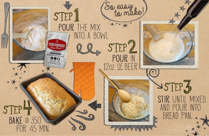
 Infographics. Infographics are often much better at explaining concepts than long lists. For example, instead of showing what’s in the box, show it on an infographic (there can be text on the infographic). Or if your project has a concept that would take paragraphs to explain, use an infographic. Soberdough does that quite effectively (see image on right). You should still enable backers to search the page for certain words by typing out those words (i.e., “shipping”).
- Use a mix of real photos and digital renderings. Digital renderings often look sharper than photos of your prototype, but I’ve found that photos of games often look better than their digital counterparts. I think part of an actual photo is that a backer gets a feeling for the tangible aspect of the reward–“That’s something I’ll have in my house someday.”
- Landscape-ify images. If you put an image on your Kickstarter page, it will fill up the entire main column. Image width isn’t an issue, but if an image is too tall, it’ll take up too much precious real estate. Cut down the height in an image editor so it has a 3:1 width to height ratio. You can see some examples of this on Euphoria (some, not all, of our images were cut down to that ratio).
- Illustrated headers and quotes. Custom illustrated headers are much more thematic and visually compelling than standard text images. They’ll take a lot more work, but they’re worth it. I always like TMG’s custom headers–see Dungeon Roll for a good example.
- No step-by-step reward level graphic. I’ve changed my stance on this since Viticulture. More often than not, this image is completely redundant. Backers know what it means to get two copies of a game–they don’t need an image to explain that to them. If you really feel the need to do it, Mars Needs Mechanics has a very compelling reward level graphic.
Core Components that Every Project Page Needs
- Description: The three lines under the project video should tell backers exactly what the project is.
- What’s in the box: Tell backers what they’re getting. Use an infographic.
- Third-party reviews: Tell backers what unbiased professionals think about your project.
- What’s unique: Give 3-5 reasons your project is different from anything anyone has ever seen. If it’s a board game, link to the rules (having the rules ready before the project begins for a board game project is imperative. It’s okay if they’re in Word. They just need to be written).
- Explanatory video: Give backers an in-depth look at your project (much deeper than the 2-minute project video allows).
- Why pledge now: List a few compelling reasons why backers should support you now on Kickstarter, including why you need the funds to make the project a reality.
- Stretch goals: List a few stretch goals to compel people to share your project. You can add more as the project continues to overfund.
- Add-ons: People need to know how they can add multiple copies to their pledge (among other add-ons, which I recommend limiting to items that can be included in the game box by the manufacturer).
- Risks and Challenges: Be real in this section. By giving examples of what could go wrong, you show that you’ve done your research and know what you’re talking about.
The Inside Scoop
There are a few things you won’t realize about the project page until you actually start to make one (which I highly recommend you do–anyone can start building a page at any time) or until it’s too late. Here’s the inside scoop:
- The preview link to your project page will automatically forward to your final campaign page when you go live.
- You can’t create an FAQ before the campaign begins, so type out questions you anticipate before the project so you can create the FAQ the minute you launch.
- You can revise the project page during and after the approval process before you launch, and any time during the campaign.
- You cannot revise the project page after the campaign is over.
- The “Risks and Challenges” section is mandatory–it’s part of the project page template. It’s text only.
Examples of Great Project Pages
Are there any project pages that you think are brilliantly crafted or have a compelling element we can all learn from?
Also see: What Exactly Do you Look at When Browsing a Project Page?
53 Comments on “Kickstarter Lesson #39: Anatomy of a Great Kickstarter Project Page”
Leave a Comment
If you ask a question about a specific card or ability, please type the exact text in your comment to help facilitate a speedy and precise answer.
Your comment may take a few minutes to publish. Antagonistic, rude, or degrading comments will be removed. Thank you.
[…] Kickstarter Lesson #39: Anatomy of a Great Kickstarter Project Page […]
[…] Also read: Anatomy of a Great Project Page […]
[…] Anatomy of a Great Kickstarter Project Page […]
Thanks for all the great info Jamey. Some of these things I already knew by scrolling through several VERY successful kickstarters. Some of these things I think I intuited just by being business minded and some of these things are brand new to me and a great eye opener. I’ll be using all that you’ve stated here to polish up our kickstarter campaign to a high sheen! Thank you again :)
What type of computer skills will someone need to make a customized Kickstarter page ?
I’m looking for someone to customize my Kickstarter page, and how does one do this ?
Don: Kickstarter makes it very easy to create a project page. If you’re looking for a graphic designer or artist to improve or illustrate the images you want to post on the page, here’s a starting point: https://stonemaiergames.com/200-artists-and-graphic-designers-whose-work-i-love/
[…] exceeded $2 million after 2 days–nor is it just that it gets so many of the fundamentals right. It’s also that Return to Dark tower refines, innovates, and implements a few specific […]
Hello Jamey! Would your opinion slightly change on this with the recent Kickstarters and there use of GIFs to show gameplay. Is this something you recommend over Infographics?
Thank you
Brian
Brian: In general, I still prefer static infographics, as I find them less distracting than moving images. If I want to see how a specific mechanism works, an embedded video works just fine for me. :)
[…] 7. Kickstarter Lesson #39: Anatomy of a Great Kickstarter Project Page […]
[…] Page: I would stick pretty closely to the tried-and-true method for project page content, though I would try to keep it as succinct and visual as possible. Given how long we’ve been […]
Hello Jamey!
I just find out your amazing lessons, they are helping me a lot to learn more about the “designer side”. I’ve been playing modern games since 2008, a little after started to sale boardgames, and at this moment I’m getting involved with design of my own game. Here in Brazil que have very few content about the developing process, I’d like to know if I can translate your lessons and post on my blog(with the credits of course!)
Thank you very much for your attention!
Carlos
Hi Carlos! You’re welcome to quote sections of my blog on your website as part of content you create, though not just repeat entire entries in a different language.
Hi Jamey. I have a question regarding image compression on the Kickstarter campaign builder and I thought your dedicated community might be able to help. I created several awesome graphics for my campaign but when I upload them to the campaign builder page, they still don’t look perfectly crisp in the preview. I’ve tried exporting at different file sizes and image quality levels but nothing seems to help. Do you have any suggestions?
Thanks for sharing, Jennifer! While I’m not sure of the answer, perhaps someone here can help?
Hi Jamey, just wanted to let you know that this post has been invaluable to my upcoming project. I’ve gone almost 3 years of ‘board game making’ and kind of felt dumbfounded at the amount of work that I still don’t know & have to learn.
Building the board game is half the battle, it seems….
[…] their full potential: they’re unwieldy, distracting, or boring. Jamey Stegmaier says the biggest campaign page mistakes include too much text, bad design, and badly constructed reward tiers. These factors don’t create […]
[…] pages don’t include every single detail about the project from Day 1. Rather, they offer the core elements. One approach that I haven’t tried but could work well for this “journey” idea is […]
Hi, do you look at people’s projects and give feedback on the layout?
If not, do you know where I could find someone?
Terry: I do not, but here are some suggestions: https://stonemaiergames.com/kickstarter-lesson-123-how-to-give-and-take-tough-love-feedback/
[…] In Kickstarter campaigns, however, it doesn’t always seem to be apparent that images make everything better. When research Kickstarters, I’m actually startled how many of them are waves of words that I’m skimming to get to the point. It’s not good advertising. Jamey Stegmaier of Stonemaier Games really hit home on this with his post, Anatomy of a Great Kickstarter Project Page. […]
[…] read: Anatomy of a Great Kickstarter Project Page and 10 Better Reasons than KS Exclusives to Back a Kickstarter […]
Hi Gera. Your product looks very cool! I had a similar debate with myself over graphics. They definitely add something and your product is particularly visual so I think they work.
I would say though, that as a viewer of your page, some of the big bits of text-as-image are slightly harder to read. The text is noticeably ‘softer’ and that may be off-putting to some. But then I’m a bit of a typography geek so maybe it’s just me!
In the end, I didn’t use that many graphical bits, mostly just the section headers.
https://www.kickstarter.com/projects/robhallifax/the-ockham-razor-a-simple-beautiful-razor
All the best with your project!
What is your take on regular text vs. text embedded on images?
We wanted to make our page more stylish so we embedded part of our texts in images (you can take a quick look here: https://www.kickstarter.com/projects/346209858/143749840?token=f37ae003).
Do you find it more difficult to read? Would it be better to put it back as regular text?
BTW, your blog is outstanding and extremely inspiring. Thanks!
Gera: Thanks for your question. For the most part I think it works well, though it could be darker in some places. The one downside to embedded text is that people can’t search the page for keywords. So I would recommend that you identify some important words (like “shipping” or “reviews”) and make sure they’re on the page as regular, searchable text.
I keep coming back to these posts. Amazing insight – thanks so much for your generous sharing.
Gary: Thanks for your response. I agree with the key point that cutting redundant information out of the reward graphic is a good move, and instead you could use that to highlight the rewards you want to draw the most attention to (or clarify).
The one thing I would question is the idea that backers look to body of the project page to see what the rewards are. I would heavily suspect that they look to the reward sidebar first (before almost any other information on the page). Perhaps Kickstarter could do some eye tracking sometime so we could know either way. :)
Jamey, you have some great project page examples up there and now that our Kickstarter is no longer active I’d like to offer our page up as perhaps mediocre page for people to learn from. Seeing the less than amazing I think is as valuable a tool as seeing the awesome. Plus I’d like to show you guys how all that gibberish I wrote above actually turned out.
https://www.kickstarter.com/projects/stonecirclegames/horrible-hex
Also here are some things I’d like to amend/reiterate from above after actually going through the Kickstarter and getting that perspective. Being our first project I think we did OK with some things and missed the mark with others but here are my thoughts for what they’re worth.
1. If you’re making a tabletop game make sure you actually label your Kickstarter under the Tabletop subsection. I think we missed out on some critical early publicity and discoveries because I missed this when I set it up.
2. Search-ability is key. From what I can tell about 20% of our backers came from either the Kickstarter search function or Google. I can’t tell what they searched for but I think this goes back to the Text vs Infographic discussion.
3. It’s confirmed Infographics are a pain to update. Especially when you have 15 other things going on or you are on a time crunch. They look nice but use them smartly.
3a. I like using the Infographic concept for Headers, Components and to resize images.
3b. I still like the Infographic for the Reward tiers however I would split each tier up into it’s own image like I did the stretch goals. It makes modifications and additions easier to manage.
3c. The Social Media Stretch goal graphic I liked, I’m not sold on the other stretch goals as graphics.
4. Clutter – It might be because I’ve been staring at the page for the last 30 days but as I look at it now it looks somewhat cluttered to me.
If you or any of your followers have comments or things you think we could’ve done better I’d love to hear them to help us in the future and hopefully help others not fall into the same traps we did.
-Gary
Thanks so much for sharing your thoughts post-project, Gary! And congrats on funding.
Something I’ve been recommending more and more is that project creators don’t use the precious “real estate” on the project page for reward descriptions, especially big infographics that, as you say, take time to update. Do you think your project page could have been more effective without the reward infographic?
Thank you, it was a nail biter!
I’ve got a couple of different ideas on it and I think the short answer is, it depends. As we’ve learned in the previous posts brevity is not my strong suit so here comes the long answer.
First, I think you’re right if all you are going to do is rehash the same information you find on the Rewards section on the right side of the page. I would certainly consider it wasted space, wasted time, and it puts you more at risk to have a discrepancy between the two areas.
On the other hand, while I don’t really have any empirical data to back it up I think there are a lot of people that expect that section to be there and that will be the first place they look to see what the rewards are. That being said I think “see” is the operative word there. I don’t think they want just want words there they would like some sort of visual representation of what they will be getting. I think if you can enhance the words you wrote in Kickstarter’s rewards section with visuals it can add value to your page.
Back to our project, I don’t think we would’ve been more effective without the reward infographic all together but if I had it to do over again I would certainly modify it. What we missed and what I think many people miss is the idea that the rewards infographic can be used to vector people to the reward tiers you’d prefer them to back. I think project creators can use it to promote one tier over another.
If I was to do our project again I would have cut the $1, $20, $55, and $155 out of the reward infographic entirely. There was no value added by repeating those tiers and I’d argue the work to create and update them took valuable time away from more important things.
The $75 and $149 had images associated with them that I believe enhanced the words that were on the side of the page and I’d likely leave those.
The $80 tier I could keep or remove it but on a snap judgement I’d probably remove it.
This leaves the $29 tier and probably the most interesting for this question. For this one I would add a graphic of the bag that backers would be getting. However, with our without a graphic I would leave this on the Reward Infographic because I would want to highlight this tier over the $20 for two reasons. First, by offering the Deluxe edition at all I have incurred a fixed cost for the minimum run of bags. If I buy 500 bags but only have 20 people that want them that’s not an ideal ratio. The second reason is I need 1/3 less backers at the $29 vs the $20 level to successfully fund. In other words for every 3 backers I got at the $20 level I would have only needed 2 if they had backed at $29 instead.
Thanks for the question and allowing me to ramble on, I really enjoy the thought exercises and theory’s that come up in your posts.
Figured I’d do a quick update. After some great feedback we got from James Mathe’s Facebook group we decided to go with a hybrid approach instead of the full Infographic layout we originally had. The main reasons for this switch were:
1. Making it easier for backers to search for specific information.
2. Much easier to work in hyperlinks to the full rule book or offsite review material.
3. We seemed to be able to get more information in to a smaller space, at least the way we had it laid out.
4. It makes it easier for search engines to find your Kickstarter page. This was something we hadn’t considered originally. James made a good point that not only do you want backers to be able to search within the page, you want search engines to be able to pick up on your page as well.
Gary
That’s great advice from James! He’s a wise man. I especially like the part about search engines.
I know I am about a year and a half behind the power curve on this blog post however I am in the process of creating our first Kickstarter Project and figured I’d share what I’ve learned so far. Keep in mind that our project hasn’t gone live and I have only received internal feedback so far so I can’t speak to whether the masses like it or not.
1. As mentioned the image upload system for Kickstarter is rather unruly.
– What I have done to circumvent this issue, is use Adobe Photoshop or Illustrator to create a template the same size as the KS window.
– The size I have ended up using is 3516 Pixels or 11.72 Inches wide. The length can be whatever you need it to be.
– From there you can copy and paste images into that template and adjust the size, positioning and add captions as necessary.
2. We have chosen to use mostly infographics to present our content right now.
– There are some definite upsides to using infographics they are a great way to make everything look neat and clean but there are also some speed bumps you may run into.
– Your backers cannot do a Ctrl+F to find specific words they may be looking for like “Rules”
– Since they are uploaded as an image you also cannot hyperlink specific words or phrases within the infographic. You can however hyperlink the graphic itself.
– We’ve used individual graphics per section instead of 1 large one. This does two things, allows you to more easily adjust the flow of your project page and also gives you additional images that you can hyperlink if necessary.
– Infographics can take longer to update properly than a text version of the same thing. Keep that in mind as you make updates to your project through the campaign.
I apologize the comment is so long but I hope this helps out some of your followers when putting together their Kickstarter Projects.
Gary
Gary: This is great stuff! I couldn’t agree more about all the points you made about infographics. I updated the entry to reflect the comment about searching the page (I think another commenter made that same point). And you’re totally right that they take longer to update than text.
Thanks for the exact width for the landscape images as well–very helpful!
[…] Anatomy of a Greater Kickstarter Project Page: Read tips for creating an exceptional project profile that will get people talking, sharing, and reaching for their wallets. […]
[…] design. Reorder items on the page. Make sure you have compelling and clear stretch goals. Use this Kickstarter Lesson as a checklist for all of […]
Demi: Good question. What you’re seeing on that project is someone using the hyphen symbol (or other symbols) on their keyboard to their advantage to delineate information within pledge levels. The final live Kickstarter page looks exactly like the preview page, so you can test out the hyphen method there to make sure the line breaks at exactly the right place.
Thanks!
Hi. I’m working on my first Kickstarter and had a super specific question I was hoping someone here could answer.
In the reward tier text, is it possible to create a line break? I know html does not work, and every time I press enter while editing the tiers, the line breaks disappear in the preview. But I feel like I’ve seen it in other Kickstarter pages (i.e. Cosmochoria: https://www.kickstarter.com/projects/nateschmold/cosmochoria).
My hunch, though I have no way of knowing, is that the preview may not show the spacing for some reason but that when it goes live, it reflects what you’ve actually typed into the levels.
If you know, I’d love some information on this! This post was really helpful. Thanks for sharing all of this information!
[…] can help you determine if you’re being as clear and succinct as possible. As I discuss in KS Lesson #39, it’s best to minimize paragraphs to 2-4 lines of text–it’s much easier to read […]
Hi Jamey, thanks yes i think i’ll do some collage style images and try to stick to the 3:1 rule. I see you’ve got a nice combination of images on your viticulture page.
Clarie: I don’t believe there is a way to do that, but there are some tricks you can use to make the images fit better, like to put multiple images on a long, narrow landscape compilation as seen in several places on the Tuscany project page: https://www.kickstarter.com/projects/jameystegmaier/tuscany-expand-the-world-of-viticulture
Thanks for all the great tips especially on the visual aspects of the page. I’ve been trying to find out if there is a way to alter the size of images inserted into the project page, which is how i stumbled upon your blog. Claire.
[…] the first few days of a project are so important. Don’t waste them on a subpar project page. Check every item off this list before you deem your project page ready for the […]
[…] like an early bird level at getting backer support? Create a great product and display it on a great project page. If you make something that people get excited about from day one, they’re not going to hit […]
[…] pages, a number of them were missing key elements that can inspire confidence in backers. Make sure all the core elements of a great project page are there from Day […]
Just a quick editing note: the link for Nanobot Battle Arena seems to be set to Xia…
Thanks Patrick! Good catch.
The text to image ratio of this post is off. :P
I like the Heerme plugin. Especially the hand-drawn logo :D.
https://www.kickstarter.com/projects/331579200/heerme
1. Eagle Games seems to do a very good job keeping things simple and ‘clean.’ I never get confused by their project pages. (examples: Fantastiqa, Triassic Terror, Francis Drake)
2. Artipia Games are whizzes with presentation and graphic design on their project pages. (examples: Drum Roll, Archon)
Good call on both of those.
Dustin: I have some thoughts about the kickstarter pages you mentioned. It is only my privet opinion about what I do like, what I don’t and what I would change to boost tthose KS pages.
1.
Fantastiqa: I like the KS page, it’s not bad at all. One thing I would change – the artwork, I don’t feel the adventure there.
Triassic Terror: IMO too big pictures of the stretch goals is making them hard to read. I think the most of the graphics on the KS page are not transparent. The font and illustrations don’t go well together, I found viewing the KS page very difficult. However, the game components are presented quite well.
Francis Drake: Similar to Triassic Terror.
2.
Drum Roll: too big pictures for the stretch goals. They lost way too much space on describing components of different pledges. One of the most important part of the KS page – reviews are on the very bottom of the page
Archon: nice artwork, however the same mistakes of Drum Rolls. The review is on the top of page – that’s good.
Do you think about my thoughts?