Last weekend a friend hosted a gaming afternoon. As people trickled in, they set their games down in stacks and in bags before wandering around.
When the time came to choose a game, our attention turned to those stacks and bags of games, part of which included these:
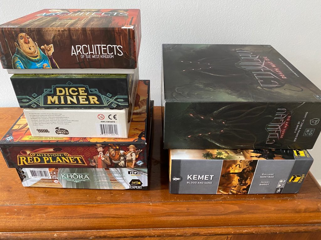
I took this photo from a few feet away, but we were staring at these games from across the room. It then occurred to me: The sides of a box can make or break if it gets to the table at a gaming session.
Why is that important? One of my marketing priorities is to do everything possible to increase the chances that our games will actually get to the table. If a game is actually played instead of sitting on a shelf (or in a stack/bag), someone who plays the game for the first time might buy it afterwards, and the owner of the game may be slightly more likely to boost their game with expansions and accessories.
This game day epiphany was particularly important for me because I had previously only considered the sides of the box to be important for brick-and-mortar retailers, not after the game was already purchased. Though even then, the games on our shelves still need to effectively call to us if they’re going to hit the table from time to time.
Out of curiosity, I asked people on Instagram which box side in the photo was the most enticing for them. Around 100 people replied (some with more than 1 pick), and here are the results:
- Architects of the West Kingdom: 35
- Dice Miner: 21
- Mission Red Planet: 13
- Cthulhu Death May Die: 11
- Kemet: 4
- Khora: 1
- Furnace: 0
In sharing their preferences, people also came up with a great list of attributes that a great box side includes:
- big, clear title
- a touch of art that conveys that theme
- player count and playing time
- both horizontal and vertical orientations (2 sides each)
- publisher logo
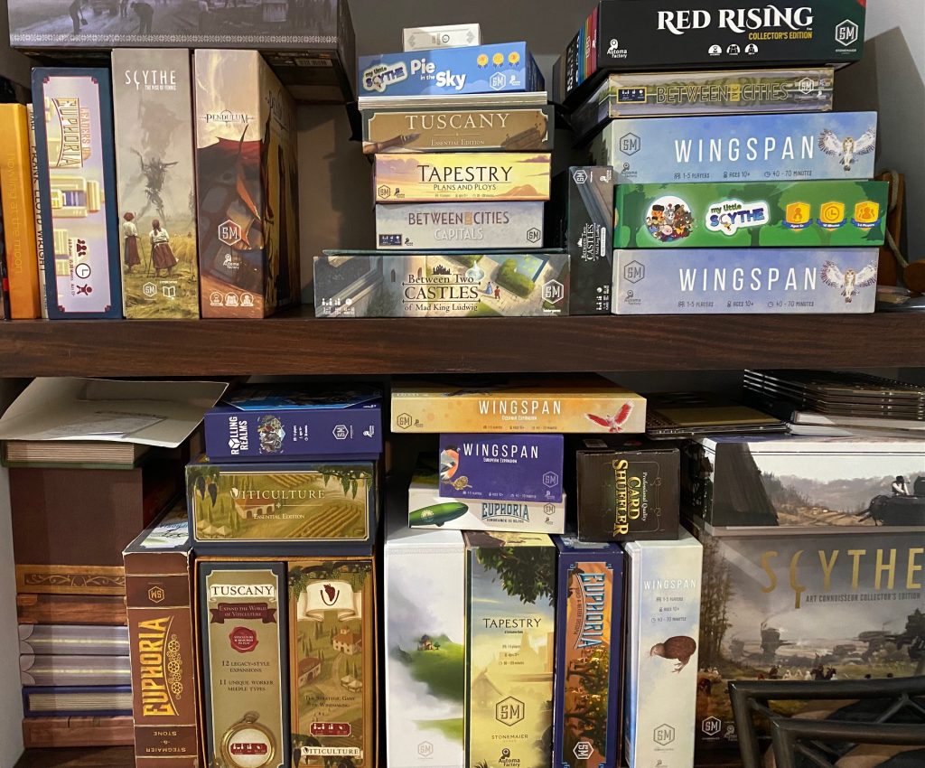
At Stonemaier Games, I think we have some mixed results when it comes to the sides of our boxes. In fact, for a while, several of our boxes (Scythe and Charterstone) had nothing but art on several sides, which wasn’t particularly effective–I have some of those older boxes on my Stonemaier shelf:
Overall, this epiphany (and the resulting feedback) was really helpful for me, as it makes me think about how the design of the box sides can extend well beyond the point of purchase.
Related to this topic, Wonmin Lee has a recent interesting post about delighting customers as they open their game for the first time.
If you’re curious about box sides that people like, I learned about the Instagram hashtag #7days7sideboxart, which people use to share box sides they like. What are some of your favorite box sides?
Also read:
If you gain value from the 100 articles Jamey publishes on this blog each year, please consider championing this content!
Update: Alert reader Doug V sent this photo to showcase how some games are designed to align with each other:
23 Comments on “An Epiphany About the Sides of Game Boxes”
Leave a Comment
If you ask a question about a specific card or ability, please type the exact text in your comment to help facilitate a speedy and precise answer.
Your comment may take a few minutes to publish. Antagonistic, rude, or degrading comments will be removed. Thank you.
[…] that a photo of the physical package makes the product feel more real to potential customers. The sides of the box also crucially help sell the […]
[…] side of the box includes the basic information and a compelling character, thus checking the boxes that Jamey Stegmaier found important in his own review of box […]
[…] small boxes that they aesthetically appreciate. I also drew on a post by Jamey Stegmaier. He did an experiment in which he showed a photo of box sides to gamers and asked which most effectively enticed them to […]
[…] that a photo of the physical package makes the product feel more real to potential customers. The sides of the box also crucially help sell the […]
[…] Jamey Stegmaier made an insightful observation on this topic in his blog last year. https://stonemaiergames.com/an-epiphany-about-the-sides-of-game-boxes/ His point was that in the heat of the moment, when you and a group of friends are eyeing which game […]
I love good box art. I store my games on kallax shelving from IKEA which holds 4 standard games per cube. I have mentioned to you previously that some of my games are displayed face out – they get a whole cube to themselves (Wingspan, Isle of Cats, Everdell etc). That’s why I asked for one side of the Wingspan nesting box to be as pretty as the box front. I’d hate to lose that beautiful art work from my games display.
‘Side Art’ that I really like… I’d say Viral, Bunny Kingdom, Oceanos, Colt Express, Takenoko, Camel Up, Potion Explosion, Scythe, Wingspan, Roll Player, Munchkin (Big Box), 7th Continent, Shōbu, Tokaido, Tulip Bubble.
Most of these are cartoony representations of the theme. The rest are classy, clean, minimal and often without pictures – just the title.
My Brother in Law actually picked out Scythe on my shelf (of 150+ games) as something that looks interesting to him. The only time he’s ever done that!
I’ll agree with a previous comment that a textless, art-only box side can be a beautiful thing. It’s what I’m hoping for from the nesting box. :)
FWIW, the textless sides of Charterstone make it one of my favorite shelf-presence boxes. I like it when not every conceivable area that could convey text does convey text — it makes for a more interesting display!
This is a revelation to me, I just went to look at our collection and feel somewhat embarrased that I never considered the side of the game boxes despite the fact this is how I see most of the games both in the B+M shops and in my own house! Definatly a nice little touch to get the game to the table more by paying attention to the side of the box, this is going in my desgin notebook!
It’s funny that the standard version of Dice Miner is so much better packaged than the deluxe version (both in the shape of the box, and in the design of the sides)
Great point, feels like it’s a similar topic as what thumbnails for videos get attention and ultimately clicked on. Especially for Netflix, I seem to remember reading about research on what gets picked. Videos and board games are different of course, but I think one of the findings was that people naturally are drawn to images of people, which is why so many Netflix preview/thumbnail images are dominated characters, not just images.
I’m curious how similar or different that is for board games (which are generally not all that character-driven), since your survey puts the games with people on the sides near the top.
Follow up: looked it up and found this, which is a little different than what I remembered but still relevant: https://about.netflix.com/en/news/the-power-of-a-picture
That article is really interesting–I may reference it in a future post. Thank you!
The only game that jumped to mind when reading this article is Oceans. All four sides were walls of text with no art. It was fine for marketing in store shelves, but i would never be drawn to the box to read it. Beautiful art on the front and back, but the sides were hideous. There were several threads on BGG about it, here’s one of them. https://boardgamegeek.com/thread/2342319/probable-overreaction-shelf-limited-edition-fug
I agree a nice bold title with the extra information is good, but I want to praise a few boxes that make the whole box a piece of thematic art. First The Gallerist which looks like a stack of canvas pieces, wrapped in torn off brown paper. One side even has the game logo cut off as the cover was “ripped” off. I prefer the side that looks like stacked paintings vs the brown logo side to face out of my shelf. My other favorite box is Burgle Bros (1) that has the helipad for escape on top and a little hole where they broke in on the bottom.
When looking at game box sides, think about how the look with other games of yours. The mast of this is Rosenberg box art. One side has a person (most of the time) with a top and bottom border that lines up with other games. When the box size is the same, they lineup. I have 18 boxes that look great together thanks to this box art. Have photo. Bottom line, keep boxes the same standard size and update the art so they go together in the bookcase.
Unfortunately for Wonmin Lee, his game’s theme already lost me (I remember seeing a Dice Tower daily unboxing with his game being unpacked…pretty sure they rushed through the unboxing and didn’t even notice the theming, sadly. Different folks hopefully will be more intrigued than me.
I will say that the game that has most charmed me the moment I opened the box was Horrified (original edition). When you open the box you’re greeted with that warning which feels like it’s right off a title card from a 1930s Universal movie (seen here: https://boardgamegeek.com/image/6053494/horrified). I make sure to fold the board when I put the game away every time so that message is always the first thing I see. It’s just such a delightful touch (as is the attention to detail, such as all the villagers, especially Abbot and Costello).
I think that box design is obviously a complicated beast. I personally always like quick information right on the box (preferably the side); being able to see how many players a game supports and a rough estimate of play time comes in handy when choosing games, either at home or at a meetup.
I store my games vertically but actually prefer horizontal (longways) text because the size makes it so much easier to read – I can’t read a little 2-3 inch title from across the room.
There’s 4 sides to a box though so I’m happy people with sharper eyesight can be catered for too :).
Something I never see on box edges (and would love to) is some extra information by player count for what kind of game it is (Coop), (Competitive, Combat), (Dexterity). I don’t tend to pick other people’s games to play at events because I don’t know what they are or whether they would appeal to me. (The biggest issue with this is that I can’t imagine it ever being ‘normalized’ across the industry).
That’s a really interesting point about conveying some sense of what type of game it is. I like that.
I think it is important to provide clear side labelling for both horizontal and vertical storage. I use both trying to get best use out of my available storage space and I do like to have the title aligned appropriately
Definitely! That’s on my list. :)
I agree with this. I mostly store games vertical with the front to the right, similar to books on a bookshelf. While I’m used to tilting my head to the right to see the titles, it’s great when there’s is a side that has a horizontal title in this orientation.
I really like how Canvas did their box art, it’s so genius because if you hang it up, then it gets way more attention than being with all your other games in your crowded Kallax or bookshelf.
I agree, that was really clever. Though I keep it on my shelf, not my wall. :)
Don’t forget the board. Plenty of times I’ve seen photos of games being played. The games often have the box nearby, but just as often there is a load of posts asking what the game is – as it looked so interesting..