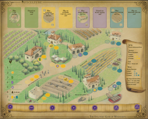
Thanks to the $35k stretch goal, we are definitely producing a double-sided game board. One side will have art with all of the various identifying text overlayed on top of it. The other side will remove those labels for players who don’t need them, and it will replace the key with outlines for placing the Arboriculture expansion cards on the board.
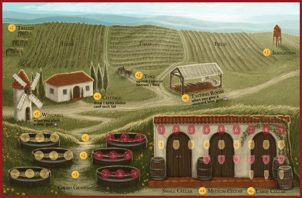
With the debut of the beautiful new art from Beth Sobel for the vineyard mats (see below) contrasting with the style of the board artist, David Montgomery, we had an idea: What if the art on the back of the board was in Beth’s style? It would look exactly like the original board (all of the actions would be in the exact same location so as to not confuse players), but done by Beth in her unique style. The labels would be removed from Beth’s side to stay consistent with the $35k stretch goal.
What do you think? This will cost extra, but it’s economically feasible if we make it the new $55k stretch goal (and reach that goal).

4 Comments on “Backer Poll: Which Art Should Be on the Back of the Game Board?”
Leave a Reply to jameystegmaierCancel reply
If you ask a question about a specific card or ability, please type the exact text in your comment to help facilitate a speedy and precise answer.
Your comment may take a few minutes to publish. Antagonistic, rude, or degrading comments will be removed. Thank you.


[…] a month ago, near the end of Viticulture’s Kickstarter campaign, the backers voted for the $55k stretch goal to be an alternate art version of the original game board unimpeded by labels (and with arbor card […]
Hi Jamey,
Some thoughts on the boards…
– For the player board, I think Tasting Room looks a bit odd being the only one with slanted text. It maybe should stay level to match the others. Also, a small picky thing would be to strengthen the highlight on the white grape and wine spots as the highlights can’t really be seen. Otherwise I think the graphic elements look pretty nice!
– For the main board, I’m not a fan of the text being on the building roofs. I think if they could be moved next to the worker placement spots that it would look a lot better. I know there’ll be a blank side as well, but still…. And one tiny nitpick, it looks like the rooster on the wake up chart is overlapping a tree slightly. Could be better if the rooster or tree was moved a bit.
– So for the “blank” side with just art… unless I play it very regularly I probably will forget what some of the things do. Also if there are any new players we are teaching the game to, or even people who have only played once or twice, that will be problematic as well. An idea for keeping the blank side sparse, but still with reminders, would be using an icon system (Alien Frontiers comes to mind as a game that does this well). The pick a card and play a card actions should be easy to iconize. The other 3 or 4 may be a bit more difficult. The icons may be useful to carry over to the “text” side of the board as well.
– Are there going to be player aids? That could be a stretch goal and could clear up the “turn order scroll” from needing to be seen on the board. It might be possible to put the worker spot explanation on the player aid as well, for when you are playing with the blank side. But I’m not sure that would work well having to constantly look back and forth, so I like the icon idea better.
Maybe one of those suggestions will be helpful. The project is looking great regardless!
Thanks,
George
George–Hey, these are all great thoughts and ideas, and I’m going to consult with my graphic designer about them. As for the player aids, it sounds like that material is covered on the key on the board, but maybe I’m not quite understanding.
Thanks!
Jamey
Yeah, I guess I was thinking a player aid might be useful for the “blank” side that isn’t going to have the key on the board (as I understand it). A player aid would also be useful if you went the icon route to explain the icons. But perhaps a player aid is not really needed as of now.