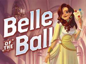
 One of the most prolific bloggers and game designers I know of is a guy named Daniel Solis. I discovered Daniel’s blog last year and tune into it almost every day to read his insights about the game design process. It’s unique to see an ongoing behind-the-scenes perspective written about in a way that helps other designers think about their games as well.
So when I saw that Dice Hate Me Games, one of my biggest inspirations for indie publishing and Kickstarter, had picked up Daniel’s game Belle of the Ball, I was overjoyed. I asked Daniel and Chris (the president of Dice Hate Me) to join me for an interview about this project, game design, box design, and Kickstarter. I think you’ll find a lot of insights in their answers, just as I did.
***
1. Can you describe your Kickstarter project and why you’re passionate about it?
Dice Hate Me Games is raising funds to produce their fifth (actually sixth) game, my card game Belle of the Ball. I’ve been developing this game for a long time and its gone through many protoplasm over the past couple years. It’s one of the rare times I came up with a theme first and had to design the mechanics around that theme. This was a tough process and took lots of trial-and-error, but with the help of a diverse community of playtesters, I came out with a fun, fast, game that retains a strategic heart.
 2. Can you name three other games that, if people like those games, they’ll also enjoy Belle of the Ball?
If you like GUILLOTINE, with its colorful characters and line-based drafting mechanic, you’ll see that elaborated upon in Belle of the Ball. If you like SMALL WORLD’s pay-to-pick mechanic when choosing your fantasy faction, you’ll like how we’ve built a whole economy around that simple interaction. And really if you like any light card game like Zooloretto, Lost Cities, or No Thanks, you’ll find something to love in BELLE OF THE BALL.
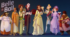
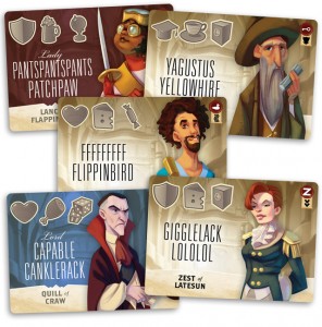
3. I love the names of the guests. Did you come up with all of those names? Based on name alone, which 4 guests would you most like to show up at a dinner party you’re hosting?
I did come up with a lot of them! I was inspired by Eddie Izzard’s sketch about how Englebert Humperdinck got his name. He runs through a lot of hilarious names like “Slop Bumwalla.” I sort of followed that path, picking up a syllable that sounded funny in the moment, or a tongue twister that I liked, but they’re all just things that tickle my sense of humor.
Chris’ favorites:
- PantsPantsPants Patchpaw
- Grumblin Gristlepinch
- Ragequit Rumplefatch
- Gigglelack Lololol
4. How did you decide that this would be a 2-4 player game instead of, say, a 2-5 or 2-6 player game? Do you have a specific method (in general) for determining number of players?
In this case, I had a nice set of 60 guests that set a natural time limit to the game. Usually players will take a guest, but sometimes they might take a Belle card instead. But each player starts with three guests in their party *and* three more per player are removed from the deck, so it still usually evens out to about 60 turns in the average game. 60 divides well for two, three and four players, so that each player gets enough opportunity to take the spotlight, do some clever play, score big points, that sort of thing. When you get to five and six players, the deck didn’t divide up as well. For any larger groups, I’d have to lengthen the deck quite a bit so each player gets at least fifteen turns or so. It’s not an exact science, mind you, just a gut instinct.
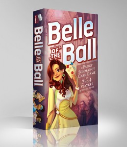 5. The artist for Belle of the Ball, Jacqui Davis, did some of the art for Viticulture and all of the art for Euphoria. She’s fantastic to work with, and amazingly talented. How did you discover her?
I’m an art director by day, hiring artists to work in the tabletop RPG industry. I’m always looking for new artists who have a family-friendly style but a strong sense of anatomy, detail, and consistency. I keep a Pinterest board of artists I’d like to work with in the future and she just popped up in one of my random searches. I’m glad to see that she is doing more work in the board game industry. She’s one of the best I’ve ever worked with.
6. As a graphic designer, what are a few common design mistakes on games that make you cringe?
Heh. I’d hate to talk bad about anyone else, so I’ll focus on my own rookie mistakes from back in the day. I’ve got the most experience designing cards, so the first thing I try to do is hold the cards in my hand as if I were playing the game. It’s very important to get this sense of physicality in your design decisions as soon as possible. It is tempting to work entirely in the computer until you go to print, but then you realize the text is too small, icons are too vague, colors are inconsistent, and they’re not color-blind friendly. I think we’ve all dealt with games where cards had one or more of these problems, and it’s hard to find a universal solution, but a good graphic designer will always, always look for ways to improve. And the best way to do that is to develop an empathy for your target demographic.
Chris adds: And don’t be afraid to turn a card horizontally when the design may warrant it. ;)
7. I hold Chris is high esteem as a game box designer. Chris, what are some of the guiding principles and philosophies that go into designing a great game box? What are your three favorite game boxes that you didn’t design?
Thanks for that, Jamey! I really appreciate it.
Designing a great game box really comes down to three things: Striking shelf presence, attention to detail, and a strong adherence to the identity of the product – in this case, a board or card game, – in relation to both the company aesthetic and the intended audience.
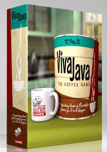 In the case of Dice Hate Me Games products, I knew I wanted all the boxes to stand out on the shelves by creating a different design feel than most other games. There is no pure standard by which a typical hobby game box design is presented, but a majority of them often feature some lone figure or illustrative scene, quite likely in a historical context. When I first set out to design the Carnival box, I knew I wanted it to have more of a pure graphics aesthetic rather than an illustrated one. I also wanted the design to have a feeling of realism, as if the box was an old, historical poster for a Carnival. I evolved that a bit with VivaJava, incorporating the aesthetic in a photo-realistic setting with the coffee can – complete with VivaJava logo – and mug. The Great Heartland Hauling Co. box took it a step further, with a photo-realistic big rig hauling cubes. The underlying themes across those three boxes is one of retro sensibilities and graphical realism. Not only do they look a bit different than most, but they also reflect the design aesthetics that players can expect from the components once they open things up.
I carried this same aesthetic principle through when designing the box for Sunrise City – my personal favorite freelance project – but we could devote a whole article as to how I came up with just the logo design.
Moving on, box backs are often the toughest part of the design process, but I always appreciate a package that shows me what’s inside and what I can expect when the game is set up. I’m always shocked when a game box only has some lines of text and a couple of pieces of art. What will the game look like once I get it unboxed and on the table? Are there a lot of bits in there, or should I expect just a lot of cards? I ask these questions when I start sketching out the box backs. The cover design should interest the prospective purchaser enough to pick up the box and take a look – but the box back is your closer. If it’s not clear as to what’s inside you risk losing the interest of that buyer.
As for three of my favorite box designs, that’s a tough question! In no particular order, here are three designs that have either influenced my own designs or caused me to stop, take a look, and, in most cases, buy that game:
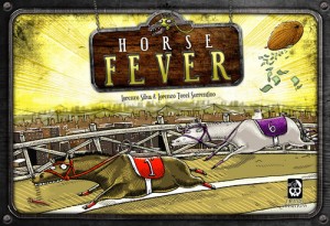 Horse Fever by Cranio Creations. I get ribbed a lot because of my passion for this game and its design, but I just love the design aesthetic of many of Cranio Creations’ games. Horse Fever’s quirky illustration style and offbeat typography immediately draws me in and makes me want to know more about the game. One subtle design tweak that’s uncommon – and often goes unnoticed – is that the box, although oblong like most Euro games, features the cover illustration in a horizontal format. This interjects a fun little mathematical and design rule known as the “golden ratio,” which is a formula for creating the most aesthetically pleasing composition. The golden ratio can be present in a vertical, or portrait, presentation, but it’s much stronger when used in a horizontal, or landscape, orientation. I won’t go deeply into that somewhat-esoteric design principle, but I highly recommend anyone interested in elevating their design to do some research into the subject. As a quick aside, the box back also shows what you’re going to find in the box – a cool board, a lot of cards, and horse meeples in the shape of those adorably quirky horses shown on the front of the box.
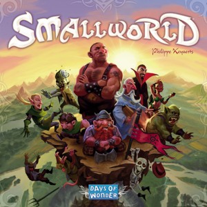 Small World by Days of Wonder. It’s no surprise to anyone when I say that Days of Wonder knows how to do things right when it comes to producing and marketing their games. They are one of the best in the industry for creating attractive and fun games, and it shows in their box design. There are more than a few great boxes – Ticket to Ride, Mystery Express – but Smallworld just screams “you want to buy this.” Miguel Coimbra’s brilliant illustration, combined with the clear and whimsical typography of the game title, beats out almost any title that sits nearby on the shelf. And, again, the box back shows you what to expect – a glorious game board, lots and lots of chits, and beautiful character design.
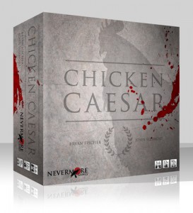 Chicken Caesar by Nevermore Games. Bryan Fischer and I are good friends and fellow graphic designers, and we share a similar aesthetic. His cover design for Chicken Caesar was finished and up on Boardgamegeek for over a year before the Kickstarter campaign began for the game – and I was hooked the minute I saw it. How can you resist a twist on the typical Roman design theme? Stone facade, etched words, blood spatters – the shadow of a rooster? Subtle brilliance. And, hey, the box back shows you what’s inside. Imagine that.
Now, good thing you didn’t ask me what were my three least favorite box designs…
8. One other question for Chris: I’m intrigued by the decision to include pre-orders for existing Dice Hate Me games on the Belle of the Ball Kickstarter. It seems like pledges for those games don’t contribute to the economies of scale for Belle of the Ball, leading to a disconnect between the total funding level and stretch goals. This was something I experienced when I put copies of Viticulture on the Euphoria campaign (something I won’t do again for games that aren’t related to one another). In the future I’ll just refer people to my website if they want to order or pre-order an unrelated game. I’m just curious about your thought process there as a fellow publisher.
This is a good question, and it was honestly a bit of a tough call for me. With Carnival being sold out since early spring and The Great Heartland Hauling Co. supplies gone after Origins, I was faced with a publisher’s best and worst case scenario – I was out of popular product. The obvious thought for that is to simply order more, but as you’re well aware, the profit margins in board games aren’t allowing us to sip on Dom Perignon and order Filet Mignons every night. Quite a bit of the profits gained from sales of Carnival and The Great Heartland Hauling Co. went into building infrastructure for Dice Hate Me Games – marketing, overhead and development of other games in the library.
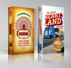 During the campaign for VivaJava: The Coffee Game: The Dice Game, many backers asked if we could provide a chance to add on copies of Carnival and Heartland to their orders. We had included a limited level for backers to pick up copies of the original VivaJava, and that all made sense given that we had them in stock and it was an upsell, not an add-on. I ultimately decided not to offer add-ons of Carnival and Heartland because there was no guarantee of the amount of funds that would be gathered for VivaJava Dice, and pretty much all of that money was going to go straight into production and delivery of that game. It also seemed weird to me to include those titles in the campaign.
Belle of the Ball, however, seemed to make sense. Dice Hate Me Games titles are categorized according to scale and difficulty. Carnival, The Great Heartland Hauling Co. and Belle of the Ball are all “Monkeys” – they come in the same box, have roughly the same card counts, and play in about the same amount of time with the same kinds of play groups. I figured that many of the same backers who were interested in picking up Belle might also be interested in games from our library in the same game category.
There are a couple of key points in rolling reprints of Carnival and Heartland into the Belle campaign: First, backers who are discovering Belle and, subsequently, Dice Hate Me Games for the first time would be exposed to previous games in the same category and might want to give them a shot. Second, by packaging Carnival and Heartland with copies of Belle – and not separately as an add-on – it ensures that those backers who choose this pledge level are not really taking money away from the production of Belle, they’re only adding extra funds that can help us subsidize reprints of our other titles.
In the end, I only considered doing this because Carnival, Heartland and Belle are all within the same category, produced by the same manufacturer, in the same box, and can be made and shipped at the same time, reducing overall costs. On top of that, all games can be shipped out to the backers in the same package, reducing our shipping logistics and helping keep costs down across the board – especially for international backers. Ultimately, I hope the the funds provided by generous backers at the upper levels will propel our final funding goal to a point where we can fund all three games without dipping into the Dice Hate Me Games coffers, but no matter what, we’ll make sure that the games are produced at the same high quality that everyone has come to expect from us, and sent out in a timely fashion.
***
Thanks, Daniel and Chris! If you like what you’ve read here and want to support Belle of the Ball, you can find it on Kickstarter here.
5 Comments on “Daniel of the Ball: An Interview”
Leave a Reply to Belle of the Ball Media RoundupCancel reply
If you ask a question about a specific card or ability, please type the exact text in your comment to help facilitate a speedy and precise answer.
Your comment may take a few minutes to publish. Antagonistic, rude, or degrading comments will be removed. Thank you.
[…] Stonemaier: Jamey Stegmaier interviewed Chris and I about our experiences together, developing Belle over many years. […]
[…] Stegmaier (Stonemaier Games) interviews Daniel Solis and Chris Kirkman about Belle of the Ball [Link] This is an excellent interview, showcasing both the design process of Daniel and the graphic […]
[…] Stegmaier (Stonemaier Games) interviews Daniel Solis and Chris Kirkman about Belle of the Ball [Link] This is an excellent interview, showcasing both the design process of Daniel and the graphic […]
[…] Games interviews Daniel Solis designer of Belle of the […]
The response to the first question includes this phrase:
“its gone through many protoplasm over the past couple years”
Is “protoplasm” an autocorrect for “prototypes”?