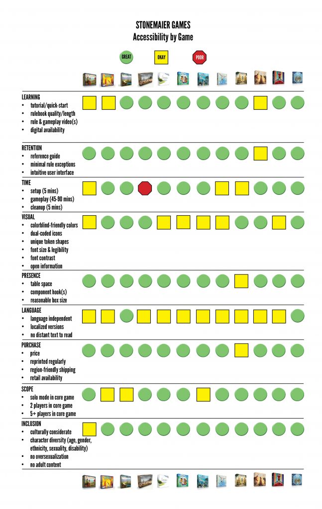
Accessibility for our games has always been very important to me, even dating back to my first game, Viticulture. I remember receiving the first sample copy from Panda in late 2012 and testing it in low-light conditions; it was then that I discovered that I would need to change the color I play in games–red–because it was simply too easy to confuse with the orange and purple colors.
Of course, like anything, learning about accessibility is a work in progress requiring a combination of research, trial-and-error, and constant observations of a variety of products. I’m still learning, but today I wanted to present a list of categories and methods I currently consider when designing products to make each as accessible and inclusive as possible.
Here’s my list:
- Learning (tutorial, rulebook length, rule video, digital version)
- Retention (reference guide, minimal exceptions, intuitive user interface)
- Time (setup, playing time, cleanup)
- Visuals (dual-coded icons, uniquely shaped tokens, font size, font contrast, lack of hidden info and distant text)
- Presence (table space, component hook, reasonable box size)
- Language (independence, localized versions)
- Purchase (price, reprinted regularly, buy from publisher, buy from retailers, regional fulfillment centers)
- Scope (player count: solo, 2-player, 5+ players)
- Inclusion (culturally considerate, character diversity [age, gender, ethnicity, sexuality], no oversexualization, no adult content)
The neat thing about this list is that you can make a really accessible game without checking every single box. Rather, these are just categories to consider when looking at a game through the lens of accessibility: How can I make this game accessible to every possible person who might have fun with it?
With that in mind, for this post I looked at each of our games from the perspective of accessibility. This chart is a work in progress. I welcome constructive criticism for additions/modifications to the metric and adjustments to Stonemaier’s scores.
I shared these categories with Lydia Wehmeyer, our Diversity, Equity, and Inclusion consultant, and she replied with some applications and insights about each of them from her experience:
Learning and Retention: Visual representations are good for visual learners and also build independence. I usually make player aids explaining the rules as simply as a I can from the actual rulebook.
Rules video: I look for rule videos that get to the point and showcase diversity. The quality of the video is more important that the size of the audience of the person creating the video.
Time: Depends on the setting and the players at the table. Always make sure you get feedback from everyone on how long they want to play and what type of game. Offer suggestions but don’t make it just about you. If there’s a person who has a disability, offer options that can provide a well-rounded experience for all.
Presence: Board games can be quite intimidating, with their large boxes and the many pieces inside. You may not even realize you need a large table to play on until you open the box, which can sometimes result in a game being unplayable in your own home. Related to this, shelf space is a premium for many people, so smaller boxes can increase accessibility.
Purchase: Games don’t need to be purchased to be enjoyed. Collaborating with libraries and other spaces where people have access to play before buying (or simply to play without buying) can be instrumental to accessibility efforts.
Scope: Have you ever sat at a table and really wanted to play a game but then discovered it had a 3-player minimum? There are a lot of games that become restricted especially if you are solo if you can’t find anyone to play with (or prefer to play solo). Not every game needs to play all the way from 1-6 players, but having those lower player counts as options can significantly increase a game’s accessibility potential.
Inclusion: This is the act of embracing and connecting all individuals regardless of race, gender, disability, age, sexuality or any other need that calls for it. It’s also about giving equal opportunities access and removing discriminatory barriers that can affect an individual within a group. Right now one of the top ways to be inclusive in the our boardgaming community is be open and provide opportunities for all to be considered as players at the table to be seen and heard not matter what background or experience they have.
Thank you so much, Lydia, for sharing those thoughts! Lydia is a teacher, so I always enjoy hearing about how she finds creative ways to connect people to games.
As I mentioned above, this list is very much a work in progress. It’s particularly hard for me to rate our own games for each category, so if you disagree with my assessment, I’m absolutely open to your perspective.
Specifically for the visual category, I’d recommend reading this article about vision impairment and how publishers can help through good product design.
If you’d like to follow our accessibility efforts at Stonemaier Games, I’ll update the chart on this page.
***
If you gain value from the 100 articles Jamey publishes on this blog each year, please consider championing this content!
37 Comments on “How Do You Measure Accessibility?”
Leave a Comment
If you ask a question about a specific card or ability, please type the exact text in your comment to help facilitate a speedy and precise answer.
Your comment may take a few minutes to publish. Antagonistic, rude, or degrading comments will be removed. Thank you.
I got my copy of Tapestry on the table for the first time today. I am blown away by the amazing quality of the components. I’m loving everything about this game. Except for one minor thing. The font for the numbers on the left side of the income chart on the income mat is way too small for me to see without magnifying it. All the other fonts I can read fine. A copy of the chart is in the manual on page 2 so I took the pdf version of it and zoomed in so now I know what the numbers are. This was not a big deal for me but tiny fonts are a bit harder for those of us who’re getting older.
You’re definitely right about the tiny size of the numbers–they really aren’t helpful, though we needed to make them small to fit. I typically just look at the icons when I need to remember the order of operations.
[…] To pair with our inclusivity efforts (BIPOC and eco-friendliness), we started off the year with a close examination of the accessibility of our products using a wide range of […]
[…] URL статьи: https://stonemaiergames.com/how-do-you-measure-accessibility/ […]
[…] very easy to get to table, whether it’s the first time or the 50th time. I think this and other accessibility factors play a huge role in whether or not a game will become […]
where can i hire a consultant or a professional to proofread my game / check for offensive content? especially for fantasy made up names that might be offensive in other languages? or just proofreading to make sure that the contents are inclusive of all types of people?
It sounds like you’re looking for a cultural consultant: https://stonemaiergames.com/cultural-consulting-for-tabletop-games/
Awesome! Yes! I knew I read about it on your blog at some point, I just didn’t know what to Google. Thanks as always Jamey!
For me, Accessibility is split between me as designer/developer, and that of game teacher/guru. As a developer/designer, the list you produced is on point with my thoughts, as well. As a teacher it comes down to only three items:
1. Rules: I can teach the rules in a reasonable amount of time.
2. Fun: I can get to the “fun” defined by the player as rapidly as possible
3. Duration: The game takes less than an hour to play.
Cheers,
Joe
I agree 100% with your first two items – though “reasonable amount of time” is a pretty elastic term, and I might consider a much longer teach reasonable than you might. And then there are games with an embedded tutorial, where the teaching time can be multiple hours because you’re playing the game multiple times with reduced rulesets before you actually get to the full game, which really stretches what counts as “reasonable”.
The point about duration is a lot more subjective – “too long” is always bad, but short games also have issues. Snacks are nice, but sometimes you want a proper sit-down meal. For me, 2-3 hours is a bit of a sweet spot – long enough that I feel like I’ve actually done something substantial, without testing my attention span (or my bladder). It’s like watching a movie rather than a TV show.
There is probably less of a potential audience for lengthy games, just like it’s easier to get someone to watch a 10 second video clip than a 3 hour movie, but that’s also true of various genres – and it feels weird to class slapping, say, a Cthulhu theme onto a game as an accessibility issue.
I would push back a little on Tapestry’s Learning ranking. The rulebook feels like it’s been cut down a little too aggressively, and the track/Tech card reference sheet is left doing a little more of the heavy lifting than perhaps it should.
I haven’t figured it out yet, but it feels like there should be a good way to structure teaching the game, and that the rules and/or player aids could do more to help find that structure.
I appreciate that this is all very nebulous and built on intuition rather than putting forward any concrete facts or specific points. I just don’t feel like I’m doing as good a job of teaching the game as I expect as someone who teaches a lot of games to a lot of people.
On the other hand, comparing to something like Vast: the Crystal Caverns (which almost takes longer to teach than to play), there’s not really any comparison, so I may also be applying a higher standard because Tapestry is from Stonemaier and I expect an easier teach.
I strongly agree with this critique of Tapestry. I’m a huge Stonemaier stan, but was left a little cold after playing Tapestry in 2019. I haven’t played it since then, so I thought I’d give it another try last week (this time, by playing it solo).
Echoing rmsgrey comments, I found the rulebook to be lacking in a couple places (especially the solo rules). I understand the desire to make rulebooks shorter; however, if the rulebook lacks information, then how else is the user supposed to learn the game?
Thanks for another great article, Jamey. I noticed that Visuals mostly discussed graphic design aspects, but the illustrations are a big part of it too. If you set the box down in front of someone or they see it on the shelf of a game store, will it appeal to them? Will the art on the components draw them into the game and world, or push them away? It’s so important to choose an artist and art director who can deliver illustrations that support the experience you’re creating.
Thanks Brian! I was thinking about that as part of “component hooks” under “Presence,” but I could also see it being its own subcategory.
Accessibility is a broad subject and I agree with you that learning about it is a work in progress. What I found interesting is how some of the categories you and Lydia mentioned tie closely with sustainability. For example, I learned that depending on the type of special glossy coatings on game boxes/boards, while they extend the products’ uses, they hinder viewing at different angles and also make the items unrecyclable. Likewise, smaller boxes can increase accessibility and reduce environmental impact. This is good because we can address both efforts at the same time :)
Hi Jerry,
I did slightly wince when I saw your list of inclusive characteristics higher up the page and in your table didn’t include the inclusion of disabled characters in the boardgames. Lower down the article we (I am a disabled boardgamer) were included, but we are often overlooked.
I once did a geeklist on this on BGG
https://boardgamegeek.com/geeklist/278192/disabled-people-represented-board-games
There’s no order to the list at all–these categories are all equally important.
Who is Jerry? :)
I’ve noticed on some games that advertise a premium coating on the board and/or box produce a glare depending how the light hits them. I’ve always been sensitive to glare but my eyes are changing in my 40’s and I’m less able to adapt and see where exactly things are on the board or read the text on the box when there is glare. In some ways I like how those coatings look but it’s not worth it if it makes use challenging. When I was a kid, I didn’t understand how my grandmother could mix up 3 of the 4 parchesi colors but now pieces that look nothing alike in one lighting can be hard to tell apart in color in another. tutorials in instructions are also helpful for accessability, it makes learning, teaching, or reviewing and getting to a real game faster and less frustrating
I absolutely agree, Valerie. In the early days of Stonemaier Games, we made a glossy game board for Tuscany, thinking it would last longer with the special glossy coating. But with any decent light source the glare made it really difficult to read the board at various angles. So we stopped using glossy coatings on boards and mats after that–all matte for us! :)
Playing a new game usually means learning to decipher a completely new iconographic system, and that can be a big friction point for me personally. I think a lot of games are guilty of printing a new symbol when a word would suffice (“draw a card”). Printing for multiple languages must be the consideration there?
Still, I think designers/publishers should build off of knowledge that players may already have (like language) when possible. Where symbols are used they should help condense a concept or mechanism, break up “walls of text,” and not veer TOO far from standard visual heuristics that gamers likely have (“that star must mean VP”).
Staring down at a board of hieroglyphics is daunting for me, and I am not new to the hobby. I think this visual element can be really restrictive to new gamers. That being said, icons can add A LOT to an experience too (the bonus icons in KeyForge come to mind).
I agree–I think a good balance of icons and text is really helpful (and I particularly like in games like Deus and Ark Nova where both the icons AND the explanatory text are on the cards).
I don’t fully agree with the fact that words are always easier than symbols. I’ve got a pretty diverse friend group and I therefore love it when the games I play are language independent. This way, I can play them in Dutch with one group, in English with the other and in Spanish with a third. I’ve actually decided to bring my Spanish copy of Tapestry to Belgium over the holidays and I just included a quick translation of all the Tapestry cards. With that minimal effort, I can now perfectly play it with people who don’t speak a word of Spanish. I just explain the civs to them and give them an overview of the translated cards.
So, what I’m trying to say: I prefer icons over text and it makes it more accessible to me as I can enjoy it with my friends in different countries.
I’m an anglophone, I don’t play in multiple languages. As someone who doesn’t live in the States, I notice that everything in the US over-uses text relative to iconography, even in airports. This includes tabletop games. English being my first language, I can easily read the English text, but iconography is faster, and usually superior.
As I age, and my middle-age eyes begin to betray me, iconography is even more preferred. And we live in aging societies.
I’m not sure I’d agree that iconology is always faster. Take a look at the Leaders expansion for 7 Wonders. It’s a fantastic expansion, but it relies solely on a vast combination of icons that require players to reference a lone manual to understand private information in their hand. If text were added to those cards to complement the icons, the leader-card draft would be far faster than it is now.
The big problem I’ve noticed with 7 Wonders’ iconography is that a significant portion of it is mnemonic rather than explanatory – once you have a new card explained, the icons kinda make sense and you can then recognise the effect when you come across the card again, but if you give someone an unfamiliar 7 Wonders card and ask them what it does, they’d struggle to figure it out. There’s not enough of a grammar to the iconography (or not enough attention paid to sticking within established grammar when adding new cards) to make them readable.
In Magic: the Gathering terms, it’s like every new card effect got its own keyword, and none of them use reminder text. Once you learn what, say, Prowess does (which was introduced after I stopped following the game) you can recognise and apply it, but until then you need the reminder text, or a reference, to explain the ability.
For me, the test of good use of iconography is whether it’s explanatory – having played the game, if you’re given an unfamiliar card or other effect, can you tell, purely from the iconography (including any embedded text) what the effect is? In other words, is the symbol vocabulary limited, and the symbol grammar clear and consistent?
And the minimum standard is that it’s a solid mnemonic – having had a card or effect explained to you, the icons should be enough of a reminder.
Terraforming Mars does a good job with its iconography – once you know the rules, most cards can be understood entirely from their icons, there’s an icon that tells you that the card’s effect isn’t one that’s perfectly expressed by its icons, and every card has reminder text to explain its icons anyway (the one flaw is that the reminder text isn’t always 100% accurate, necessitating the rule that the icons trump the text – except where the icon for an exception is used).
Of the Stonemaier Games games I’ve played, I’d call out Tapestry as borderline good/adequate in its iconography – most of the game is fine, and with everything except Tapestry cards in hand being open information anyway, the unique/rare icons found high on various tracks and on certain Tech cards are a lot less of an issue than they would be if they were appearing privately. It’s still enough that I notice them sticking out when teaching the game.
I am biliingual and often play with friends of different native languages, so clear icononography and reduced reliance on text in-game can be a big help. And due to aging, I’m also now finding it very difficult to read text on cards in dim light (which is the typical situation when meeting in pubs to play). But confusing iconography, especially without a good player aid showing conditions and effects of each type of icon, is even worse than excessive text in my opinion.
Great chart! I’m curious why My Little Scythe gets a “poor” on Visual. I also might put Tapestry as “Okay” on the Purchase category purely because the price makes it more of a luxury game than the others.
I’ve gotten feedback saying that My Little Scythe is difficult for those with colorblindness (particularly the dice).
Hi Ryan – Confirming Jamey’s response. For me, it wasn’t playable out of the box, but with some minor mark-ups to the dice and board I can distinguish areas now.
My review is listed on the My Little Scythe media page (search for Colorblind Games).
https://stonemaiergames.com/games/my-little-scythe/videos/
Awesome chart and analysis, thanks for sharing!! Here’s a couple thoughts I had while looking at it, figured I’d toss them out here:
Have you considered looking into the readability level of your written materials (rules, flavor text)? There are a lot of different evaluation methods that all look at slightly different metrics (sentence and paragraph length, frequency of most commonly known words, etc) and you can find all kinds of resources for dropping in text and getting scores. A game with text at a 6th grade reading level is a lot different than a game with text at a 10th grade reading level when you are considering accesibility for so many reasons, and I think this is often overlooked and overestimated.
Another one that I think about a lot is legibility of fonts. In addition to font size there are a lot of fonts out the that *look* really cool and flavorful but make it much harder for some people to read. Even if someone doesn’t have any particular vision or reading related issues, having a highly stylized font adds another rock to the cognitive load bucket, and for someone struggling with cognitive load each additional factor is just that much closer to the point where that bucket gets too heavy and the game usually isn’t “fun” anymore.
Angela: These are great notes–thank you! Yes, we think about fonts quite a bit (especially my graphic designer). You cover them well here, but one that I’d add is how different fonts are more or less legible when read from different angles (like upside down).
Mark Brown does a really cool yearly video about how accessible this year’s games were (https://www.youtube.com/watch?v=-IhQl1CBj9U)
Although it’s for video games I always find this to be a fascinating watch
That’s great! I like his addition of “difficulty.”
More support on this topic of Difficulty=Accessibility.
https://caniplaythat.com/2021/12/17/difficulty-in-video-games-is-accessibility/
Very cool diagram and its impressive to see a publisher track such things. Have to say that I love that so many of your games support one to five players. Two to four seems the calling card for other publishers. Keep up the great work!
Yeah, I thought about that when making the chart, but the important information on the chart is the text itself.
Time is very important to me and my game group. We tend to get together once a month. And at the pace games get released, we spend a lot of those days learning.
We make time to replay games we love, as well. But if the game takes an incredible amount of time to set up, we tend to skip over them to maximize our playtime.
It’s one reason I think games like Wasteland Express or Dice Throne (with storage solutions that are also a set-up) quickly become my favorites.
For those of us that can’t play games in person regularly (no matter how much we’d like to haha), time is a premium. And the storage solutions i’ve seen are evidence that the companies making these games can do something about it.