I am not a graphic designer, but I am in charge of marketing at Stonemaier Games. I’m constantly trying to find better ways to help potential customers understand our products and decide if they’re a good fit, and I often do this using a combination of images and text.
This is an area for which I often turn to crowdfunding projects for inspiration, as the best of them use beautiful infographics. However, many crowdfunding campaigns suffer a little from the luxury of space–there’s no limit to the length of a project page, but there is a limit to how far most spectators will scroll.
In other words, I’m always looking for the type of infographic that combines the most important information all in one place so people don’t need to scroll at all. For the last year or so, this is the format I’ve used:
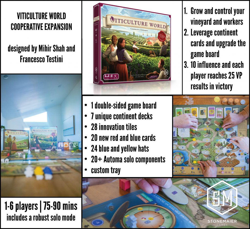
This format uses photos to show people what the game is, a component list to convey the amount of content in the box, the core stats, and a broad overview of what you’re doing in the game.
I created images like this for all of our games–they’re on each respective game’s page. But I must admit I’ve never been full satisfied with this format. It informs, but only superficially. There just isn’t enough information to entice or connect.
So starting with Viticulture World, I experimented with a new format in which I go into a bit more detail about how to play the game:
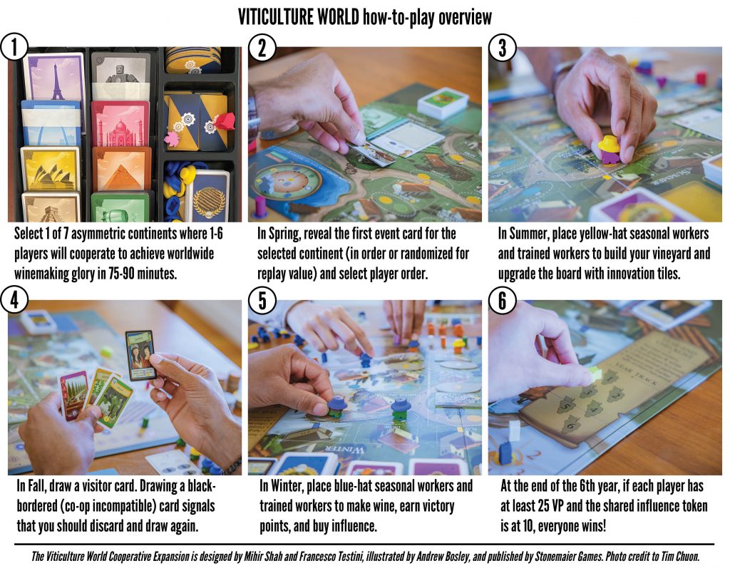
I use the extra text space to give more context to some of the exciting elements (e.g., the number of asymmetric continents, event cards can be randomized for replay value, innovation tiles upgrade the board, workers have hats, etc).
Originally I created this infographic to accompany the other format, but I think this format will instead replace the its predecessor. It’s still a work in progress, but I really like how concise it while not being overwhelming (in my opinion).
It’s also still not entirely comprehensive, as it doesn’t include quotes from reviewers and it doesn’t display our laurels. It doesn’t include price or dates, though that information is right above it on our product pages.
I’m not sure if that information–and anything else missing from this catch-all infographic format–needs to be in this infographic or if a pairing of two graphics would be better. But I think it’s a good start, and perhaps something for crowdfunders to consider to put on overly long project pages.
Also, I should note that this format does not work well for Instagram, which greatly prefers square images. For Instagram, I think it’s helpful to separate each of these sections into its own image, and post all of them in a series.
What do you think? Which infographics, images, and text have you found the most helpful? (UDPDATE: I love the idea from the comments of adding a short metric chart that indicates the level of luck vs agency, tactics vs strategy, theme vs mechanisms, complexity, and perhaps time to teach/learn, length of rulebook, colorblind friendliness, language independence, and environmental impact. This could be subjective, or data pulled from BGG, like weight, rating, and core mechanisms. Perhaps a general score for eco-friendliness or accessibility could work too, mention a few similar games as we do on our product pages, and list a few key components.)
Also read: Anatomy of a Great Project Page
If you gain value from the 100 articles Jamey publishes on this blog each year, please consider championing this content!
26 Comments on “My Latest Attempts at a Compelling Catch-All Infographic”
Leave a Comment
If you ask a question about a specific card or ability, please type the exact text in your comment to help facilitate a speedy and precise answer.
Your comment may take a few minutes to publish. Antagonistic, rude, or degrading comments will be removed. Thank you.
I’d also consider a font that is not condensed. I understand that the space is limited, but in terms of legibility, it would go a long way.
Best feedback I can give you is that you can change the way you deliver information depending on where it is placed. This is sort of going into what you’re saying about instagram, they prefer square images.
This is separate from the information you want to convey, since the same information can be displayed in several ways. That said, if it’s not a stand-alone bit of information, then the content can also vary. As in, this infographic on the Viticulture page has a lot more information around it about the game, so the infographic is more of a supporting eye-catcher on that page.
If I were to design this, I think I’d change it up a bit depending on location and information.
On the pages on your own website I’d not use the infographic, instead I’d use supporting images or maybe an automated slider that shows the text with the related mage. also I’d refrain from adding text to an image but rather add it as separate text on the website (this is better for search engines and usability (copying, better scaling etc) and accesibility (some people use text-readers which read the website texts out loud, this doesn’t work if the text is added within the image).
While instagram isn’t very good for separate text, it definitely works well with posting multiple images, so in this case each part of the infographic could be a separate image. In this case I would add the text – or part of it – in the image with an elaborated text in the post itself.
On the overly long project pages, you can use the benefit of people scrolling through it. So each of your ‘steps’ from the infographic could be a point you scroll by, these are usually also the kind of pages that add brilliant graphics to spice it up, so this might require the hiring of a designer.
When it comes to stand alone images, it really depends on the information you want to convey. The laurel image you use is a good overview of Stonemaier’s top selling games. If that is the intent, then it works very well. Of course this could be fine-tuned, for example it shows how many translations are available, personally I don’t see how this fits in line with the other statistics shown.
A catch-all is kind of difficult, while the content might be catch-all the image won’t be since it won’t fit everywhere and vice versa if you have the best image in the world, it might not contain the proper content depending on where it is placed.
Considering you have quite the community with Stonemaier Champions, perhaps you could ask what they find is the most important content about a game they don’t know yet, based on this you can decide what you might want to put in your infographic.
This has become quite a long reply, but it comes to that there’s not really a catch all so for each bit of content you should look at these two things:
1) Decide the content you want to share based on where it is placed and what information you want to convey at that location.
2) Decide the what would be the ‘best’ way to display the content based on where it is placed.
Something I’ve heard works really well to help out with this is Canva, a tool to create a library of graphics to quickly make content for different things like instagram, websites, videos etc.. (I myself use Adobe for these things, so don’t have any experience with Canva)
My immediate thought on the older graphic is that the numbered points in the top right are a bad idea – the immediate suggestion is that those three points are sequential, while, if I understand the game correctly, 1 and 2 each happen over most of the game, while 3 then happens at the end. Having simple bullets rather than a numbered list would remove that implication.
In the second infographic, the numbered points are actually sequential, avoiding that confusion entirely.
I do like the second (newer) version as it tells me something about how the game plays and where the components come into effect. I actually got a feeling for the game, rather than with the 1st image where my eye just wandered around not really focusing attention anywhere.
The two formats achieve different purposes.
Your old one gives a better first impression. It’s more approachable and more readable (I can’t read the text in the new one on my smartphone). It highlights only the hooks and components (i.e., what am I getting for my money?) It’s effective at making me want to learn more and consider purchasing.
Your new one introduces how to play the game. It highlights only the player experience (i.e., what do I do on my turn etc?) It’s effective at making me feel that I should read the rulebook or watch a video for more details.
It might be good to continue using the old infographic at the top of landing pages and to consider using the new format at the top of Rules, Translations, & FAQ pages. Your Viticulture World page currently has both. If you’ll have both on the same page, it might be better to put the old format first because it’s more approachable and less detailed than the new format.
Thanks for your feedback! It does sound like I probably need to have two graphics, one approachable graphic showcasing a few key elements and metrics, and another to show how to play.
One thing I usually always need when looking at a new game is the type, which isn’t always displayed for some reason. Perhaps if in the first infographic you list the prevailing game type in the section that lists play count and time?
Also, and this would be for after release, you can include the BGG score, weight count, and suggested player count? These are things I always go to check, especially if it’s a game I’m finding out about after it’s been out for a while.
That’s a great idea! Can you clarify what you mean by “type”? Like, competitive vs cooperative?
Like Worker Placement, Press Your Luck, Deckbuilder, etc. Essentially so that with the snapshot they can also get the core game mechanic (which is what I originally meant, but also agree with adding competitive vs cooperative vs 1 vs many
The core mechanism, got it! Thank you!
For psychological reasons, I think a picture of people having fun goes a long way, at least one picture of at least one person being excited to play the game could be good. Humans often dont know what they will like (mimetic desires) so we look at what other people are enjoying or looking at.
Im not sure if you have room for it, but text under someone experiencing joy, about what SM has found people enjoying about the game the most, could be good. For Scythe, for my group, its usually the combat card reveal.
I like the idea of highlighting moments of joy!
There was a really great (albeit short) discussion in a recent At The Table podcast episode with Ben Maddox in which they discussed the “standard” game information on boxes in places like Germany. Apparently, it’s quite common there (and I’ve seen it occasionally elsewhere) for a game to carry something like a nutritional label with metrics such as “Luck”, “Complexity”, “Theme”, “Strategy”, etc. along with a listing of some standard mechanics. I’d *love* this everywhere, but I think it’s a good start for the kind of infographic you’re building. At a glance I can quickly determine the kind of game I’m looking at and make a good guess whether it’s going to be up my ally.
I really like that, Dave! I’ve seen that on Kosmos games for sure.
Yes, but such things need to take the audience into account. E.g. GMT titles have a scale for “complexity” and “solitaire suitability”, but that complexity scale is relative to GMTs customer base of wargame affectionados. An average euro game player would shake their head at even a 4/10 complexity GMT title (unless they were Lacerda fans).
There are a few things I’m looking for in order to make a decision on funding (or purchasing) a new game (or expansion). Over everything else, I’m looking for complexity, visual impact, and perceived playability for 2 players. I sympathize with the fact that some board gamers won’t read an extended scroll; but that’s not me. My comment would be to include more information, rather than less; because even if only a portion of your viewing audience will read everything, some of your most passionate and loyal customers are in the group that will. I think it’s perfectly reasonable to include additional detail and in-depth information at the end of a scroll, acknowledging that only a small percentage of viewers will absorb all of the extra information. If the additional detail is offset or titled as a “ detailed information for those who want it” kind of title, I think the folks you’ll reach who want it will outweigh the ones who get upset at the length of the scroll (quite frankly, those people are going to find criticism about something… so impressing them may be a fool’s errand anyway). So, while I appreciate the need for overview graphics at the top, some of us (who probably include a higher percentage of your most passionate and loyal customers) are thrilled to find a long scroll with lots of colorful, impactful detail on the components, playability, and theme of the game. As always, thanks for asking us for input.
Thanks for sharing your thoughts, Aaron! I completely agree that I want access to as much information as possible; at the same time, I want the most important, enticing information front and center without requiring me to hunt it down. I hear you about an extended image (or a series of impactful images). I’m curious what other information you’d want in those images. You mentioned “additional detail and in-depth information”; since we always provide the final rulebook, does that cover such a request? We spend so much time and effort conveying details and in-depth information in a visually appealing and intuitive way in the rulebook.
I wonder, since most people hold their phones vertically, if the Grid would look better with 2 horizontal spaces and 3 vertical? It seems like it may be easier to fit the whole graphic on a phone easier if it was “portrait” vs. “landscape.” And in that way, perhaps the font could be a bit larger too, which is my biggest problem.
For the phone, I really like that idea. For PC/web, I like horizontal. I’ll play around with it!
I have been noticing the change in format and have seen that when I zoom in order to view it on my phone, they are a bit grainy. I have been able to read, but if someone needed to zoom further to read it, it may start to be a problem.
Looking at the details in the images also are sometimes a problem.
Yeah, it’s something weird with the Indesign export. I’m not quite sure how to fix it.
You may want to try to export as a PNG file rather than a JPEG. Jpegs tend to compress the file size and the result is more damage to the image. PNGs work pretty much the same as a Jpeg and are usually around the same size without damaging the image.
Thanks Chad! I’ll give that a try.
As a Graphic Designer, I find it fascinating that you discovered the benefits of the Grid Pattern for Layouts all on your own. It is definitely one of the best layouts for graphic design and page layout. While the Grid is not as Visually “Exciting” as Mosaic Feel, it is much easier to convey information. Nice Job!
Also, You are right to be worried about people not scrolling far enough. It’s hard to keep the viewers attention. I have found that any Image they see as they are scrolling will hold their attention. So you could make use of multiple Infographics spaced out with a few lines of verbiage and still hold their attention. Looks Great!
I personally look for different elements depending on whether it is an expansion or a new game. I think that a how-to play overview is great for a completely new game where the mechanics should sell it but for an expansion a components list is better – how much cool new stuff am I getting to expand my game? The how-to-play Viticulture World infographic is very similar to base-game Viticulture and wouldn’t really draw me in (also it’s too small to read on a phone). But hats for your workers? Count me in!
Thanks Sarah! That’s a great tip about a new game vs expansion.