Thanks to yet another great conversation with Jazz at The Lobby of Hobbies, today I’m going to share my thoughts on the image format for YouTube video thumbnails. I also owe my gratitude to Ed at Pencil First Games, as he advised me years ago to start using custom images on my channel instead of the default images provided by YouTube.
One of the main reasons I wanted to write about this topic is because despite the hundreds of gaming-related YouTube channels I subscribe to, in my opinion, strikingly few of them do a great job with their thumbnail images (which are actually full-size images that YouTube condenses).
Case in point, click here for your YouTube subscriptions and scroll through the results for a moment. Which thumbnails jump out to you? Which can you instantly associate with a specific creator? Which are hard to read or are unclear about the topic? Which images draw you in?
Below I’ll highlight what I believe are the key aspects for effective YouTube thumbnail images.
- Showcase the featured topic: If your video is about a specific game, use a clear image of that game–ideally the box image–and the name of the game as part of the text on the image (big, bold text–thumbnails are small!). I think this is crucial information to convey at a quick glance.
- Identify the type of content: If your video a review, playthrough, how to play, comparison, etc? The most effective images convey the type of content. The title below the image is helpful, but the images are far more eye-catching and easy to skim through.
- Clear, consistent branding: when I’m scanning through my YouTube feed, I want to be able to quickly and easily identify which videos are yours, even if there’s a slightly different format for different types of videos. We all have favorites, right? I know I’m going to watch everything that ThinkerThemer produces, so the consistency of their images helps me quickly pick out their videos from the others in my feed. Using a distinctive, bold color can also help (see BoardGameCo).
- Don’t block info with the timestamp: In the bottom left of each YouTube thumbnail image is the length of the video, which YouTube superimposes on top of the image. Because of this, it’s really important that you don’t position any information (particularly words) in the bottom right.
- Show your face and be aware of the impact of your expression: I don’t quite understand the psychology of this, but I’m definitely drawn to videos where the image features the face(s) of the person who will be talking to me. However, I’ve found that the expressions on the faces in these photos has a pretty big impact on my desire to watch the video. If the person looks angry, for example, I’m more hesitant to watch the video (unless it’s the topic is controversial). I’m more drawn in by people who look excited to talk about the game. That’s just me, though–I’m curious about your thoughts.
- Avoid redundancy in the title: Secondary to the image is the title directly below the image. The text here is helpful for search-engine optimization, and I think it’s best to lead with the featured topic and then note the type of content (e.g., Ticket to Ride – How to Play). The biggest mistakes I see here are titles that lead with something that makes no sense to most viewers (i.e., an acronym and episode number) and note the name of the channel (which is completely redundant, because YouTube lists the channel name directly below the title).
Here are some examples (some may be slightly cut off, but you can see the full image if you click on it):
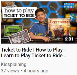
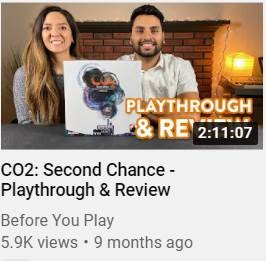
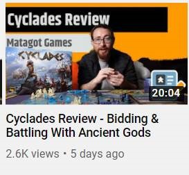
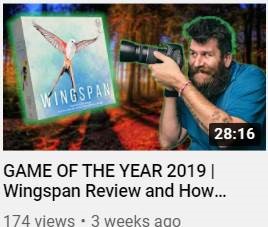
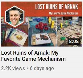
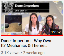
Channels showcased here are Kidsplaining, Before You Play, BoardGameCo, How to Roll Dice, my channel, and ThinkerThemer.
A few things I learned about my channel by having this conversation is that I need to do a better job of showcasing the game box in the image, as that’s the most recognizable element of any game. Also, I’ve been using the label “Sunday Sitdown” on my weekly long-form videos even though that title probably doesn’t make sense to most people at this point (it’s something I came up with off the cuff when I started making the Sunday videos). So I’ve removed those words from my Sunday image template.
If you’re a YouTube creator, I’d recommend you do the same: Look at your thumbnails through the eyes of (a) a viewer who is familiar with your channel and (b) a viewer who is new to your channel.
If you’re looking to upgrade your image, consider contacting www.ricardoferreira.pt, as he’s been incredibly generous with a number of the BIPOC content creators with whom Stonemaier Games has consulted over the last 9 months. Also, big thanks to Dave Hewer for creating the image templates I use for my channel.
What did I miss? Do you have some other examples of excellent YouTube thumbnail images?
Also read:
- Top 10 Ways to Be a Likable Content Creator
- 5 Low-Tech Tips for YouTube Creators (2020 Edition)
- Top 5 Things to Know About Content Marketing
- Everything I’ve Learned as a YouTuber
- How (and Why) I Blurred My Recent YouTube Video
If you gain value from the 100 articles Jamey publishes on his blog each year, please consider championing this content!
8 Comments on “What’s the Most Eye-Catching Format for YouTube Thumbnail Images?”
Leave a Comment
If you ask a question about a specific card or ability, please type the exact text in your comment to help facilitate a speedy and precise answer.
Your comment may take a few minutes to publish. Antagonistic, rude, or degrading comments will be removed. Thank you.
What about how to name your YouTube videos? I’ve read that the thumbnail and the title are the two most important things when uploading a video.
Maybe not necessarily the case for a simple cut-and-dry review game. But maybe not?
Definitely! Here’s what I said about the name of each video in the above article:
“Avoid redundancy in the title: Secondary to the image is the title directly below the image. The text here is helpful for search-engine optimization, and I think it’s best to lead with the featured topic and then note the type of content (e.g., Ticket to Ride – How to Play). The biggest mistakes I see here are titles that lead with something that makes no sense to most viewers (i.e., an acronym and episode number) and note the name of the channel (which is completely redundant, because YouTube lists the channel name directly below the title).”
Your thumbnails are very professional and instantly recognizable. In the Most Creative category, check out Eric Rosen (https://www.youtube.com/channel/UCXy10-NEFGxQ3b4NVrzHw1Q). He’s a chess streamer, but since he’s also an amateur photographer and a semi-professional Photoshopper, he’s become a master of the creative/eye-catching and likely view-catching thumbnails.
I definitely like it when a channel uses something as simple as color in their thumbnail to make a difference between categories. This helps a lot with looking for a certain video.
What is your thought of the thumbnails with over the top expressions (mouth wide open etc)? I read some research that showed that these work the best but personally I get annoyed just looking at it.
I can’t say universally that over-the-top expressions don’t work for me, as there are a few types of videos (like reaction videos) where they can draw me in. But generally I’m drawn into videos where creators simply look happy or excited. If their expressions in the thumbnails are too over the top, my initial impression is that the video itself is also going to be goofy.
Thanks for these suggestions and examples (all are channels I subscribe to). Since December, I have been trying to do a better job of making thumbnails with some of the suggestions you gave after hearing similar ideas from another content creator and looking at thumbnails that stood out to me.
Thanks for sharing! I must admit I didn’t realize you had a YouTube channel, but I’ve now subscribed! (https://www.youtube.com/channel/UC6qEqFHzZURHwbJNvDB5DcA/videos)
Wow! Thank you! That means so much that you would subscribe.