In a recent survey of Stonemaier Ambassadors, I asked them to pick their favorite vision-friendly game. Their suggestions spanned a broad variety of games, all with a single goal in mind: It’s easy to see and differentiate important gameplay information no matter your eyesight, colorblindness, seating position at the table, or lighting conditions.
I compiled those games into a list of 10 that I thought were great examples, and then I sat down with vision expert Gary Bartos…and learned that even these games could be more vision friendly! It was a truly illuminating discussion.
Part of the lens Gary uses to look at games (and everything else people interact with) are as follows:
- Learnability – How easy is it to learn how to use the system?
- Efficiency – How quickly can tasks be accomplished?
- Simplicity – Are the controls as simple as possible?
- Aesthetic – How pleasant is the user interface experience?
The games we discussed included:
- Azul (dual-coding)
- Dune Imperium (dual-coding)
- King of Tokyo (font size)
- Nyctophobia (everyone closes their eyes to play)
- Parks (minimal text, good contrast, big icons, unique token shapes)
- Skull (no text, giant icons)
- Splendor (big icons, dual coding, open information)
- The Crew (dual-coding)
- 7 Wonders (cards are close to your face, big icons)
- Wingspan vision-friendly cards (special cards we printed this year)
Here’s the video:
The company Gary runs, Echobatix, develops assistive technology for the blind, the DeafBlind, and those with low vision.
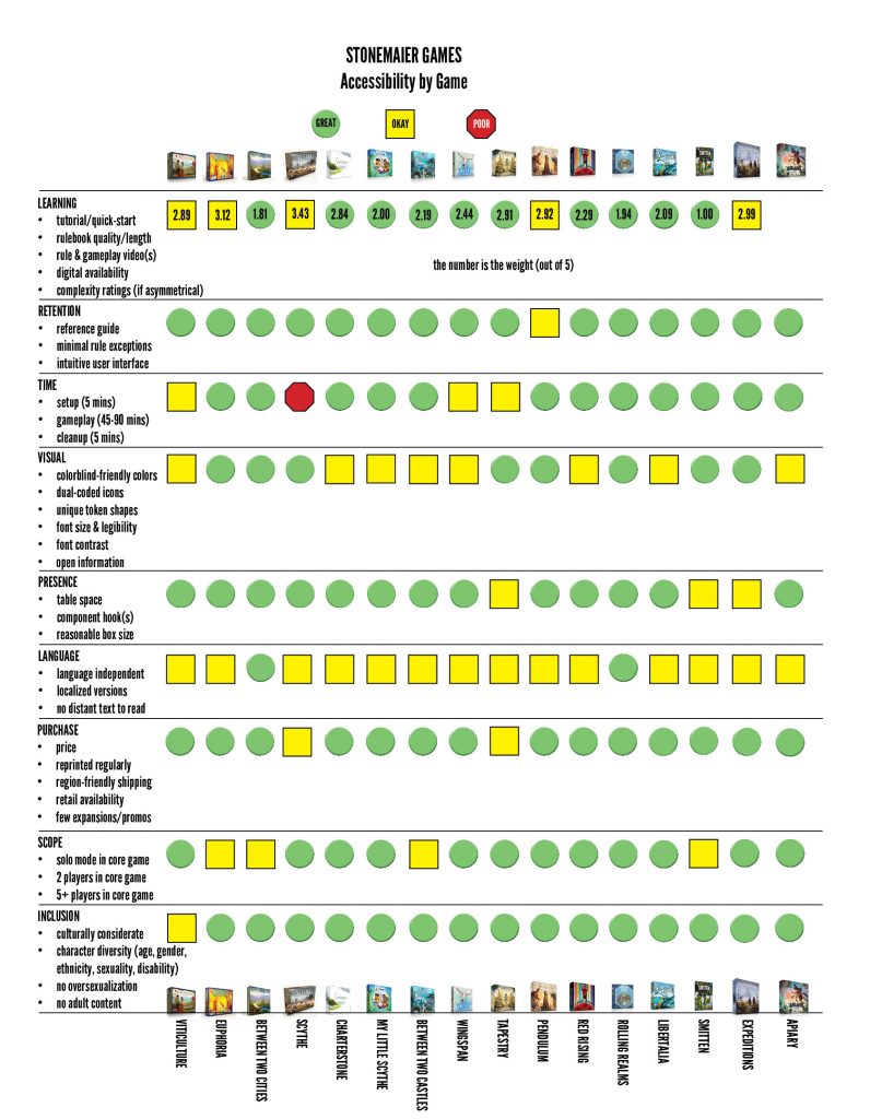
Also, today I added our new game, Apiary, to our accessibility chart. I think Apiary does pretty well in the vision-friendliness department, but there is text on many of the hex tiles that you need to read to make a strategic decision when selecting them.
Read/watch more about accessibility here!
***
If you gain value from the 100 articles Jamey publishes on this blog each year, please consider championing this content! You can also listen to posts like this in the audio version of the blog.
18 Comments on “10 Vision-Friendly Games…or Are They?”
Leave a Comment
If you ask a question about a specific card or ability, please type the exact text in your comment to help facilitate a speedy and precise answer.
Your comment may take a few minutes to publish. Antagonistic, rude, or degrading comments will be removed. Thank you.
I was playing a quick game of Walking in Burano this morning and realized that it deserves mention on this list. Every color of house has a different symbol on them to help with colorblindness. Yellow-lightning bolt, blue-water droplet, etc. Now are they perfect no. The symbols are small and lightly shaded and aren’t all in the exact same location so there are flaws to the system but it does make an attempt, even if it was not executed greatly.
I am red-green deficient (color blind) and struggle with some games as a result. It can be very frustrating. As such, I rely on dual coding quite heavily. However, some iconography used for dual coding in some games are so identical and/or minimal that I either miss it or confuse it with another icon.
For me, the icons don’t have to be huge, but they do need to be somewhere that is obvious and very unique (a star versus a paisley vs an eye, etc.).
That being said, the majority of my struggles aren’t even with printed color but are more so with colored components. Games with wooden cubes can be very difficult for me, especially if the colors are in the same color scheme. Reds, dark oranges and browns; blues, pinks and purples; greens, yellows, light browns and light oranges. If a game has similar components with these color groups, it makes it challenging and frustrating. I once played a game where I spent three turns building up a strategy for an awesome play only to find out that I had the wrong colored pieces. I had a ton of blue pieces but the play required purple (or something to that extent).
My request for game creators is that you use uniquely shaped pieces (dual coding on a 3 dimensional scale) and/or high contrast pieces. An example of the latter could be that for a four player game, you could have player components consisting of two complimentary colors (like red and cyan) that are both bright and two other complimentary colors (like magenta and green) that are both dark. The darks would be differentiated from the brights and complimentary colors are naturally differentiated from each other.
I bought Wingspan as I expected it to be suitable, but we never finished a game. I’m afraid it is completely unplayable for my wife who is now registered blind but can play other games with a magnifier and help from other players. The cards are simply not readable with the choice of black text on brown backgrounds! And Between 2 castles of mad king ludvig also suffers to the extent that even friends who are simply getting older can no longer easily make out the text and icons in the tiles.
Thanks for your input, Gary. The vision-friendly cards for Wingspan can help, and in the later printings of Between Two Castles we addressed that issue.
Really cool breakdown though I think I’d like to dig deeper into retention. For example Scythe does have a lot of nuance (if not exceptions per se) to movement especially with riverwalk that some people retain better than others. Not sure if different amounts of spatial awareness might be at play here and I’ve learned to just chalk games where pieces move around a map to just being “harder”.
Having taught games it’s also interesting which games people use reference guides and which ones they get ignored (my table follows the boards in Root super closely but won’t touch the riverwalk cards in Scythe).
Lastly are missed actions and triggers. Two SM examples could be Tapestry (I tend to recommend civs without triggers or less planning ahead to less confident players to offset this) and Expeditions (I would steer a newer player to meteorites and quests over upgrades). I’ve seen this happen more often in these games than in Pendulum because trying to take your worker’s action in time is a major element of the game so it draws people’s attention.
I’ll have to check out the video. Accessibility’s a cool subject and I think retention is an often overlooked subject compared to the initial learning process.
Thanks for your thoughts, Jev! Those are great points about different forms of retention and how much we ask players to remember about our games.
A couple more games and your chart will need a vision accessibility assessment. :)
That’s true! Though it’s a higher-res image, so you can zoom in. :)
Not quite as easy to zoom in on a mobile device eg iPhone. Even with vision problems I do this but the page is too wide so need to move around a lot – not quite sure the answer to solve. The game icons at the top are quite small – could you add the name in as well? And maybe even a link to a list by game with each category as an option
Definitely, the names are listed at the bottom. :)
When looking at vision friendliness of games we missed the key one with this story: color blindness. Our gaming group has two member that have different color issues. Two games that needed and did make changes is Splendor and Ticket to Ride to address this issue. Splendor now has different gems on the cards with the color (first ones did not). Ticket to Ride first addition only had colors on the board then came out with the new board with symbols (they provided a new replacement to us for free, when asked). Color tones can also be an issue.
Absolutely, color blindness is huge (About 8% of men, 0.5% of women are color blind). Gary and I talk about it several times, and that’s what we’re referring to with “dual coding” tokens and icons.
It seems like the tie between language and vision friendliness can be a big challenge when designing components. The more complex the game, the more card or tile text there (often) is. Game designers can easily accommodate visually challenged players by choosing colorblind friendly colors, easy-to-read fonts, contrast between text/icons and background, etc. That’s just a matter of trying to see the game from another perspective and making inclusive artistic choices. However, sometimes a designer can’t get around using a lot of words without sacrificing meaning, so they run into problems with font size or have to eliminate other elements on the card in favor of readability. I think the vision friendly cards strike a nice balance with that, despite losing the flavor text. Being in my mid-40s, I wonder how long I have until some of my favorite games are challenging because the font size is small. In a few years, I’ll be over here with a magnifying glass and readers! :)
Great points, Julie, and I completely agree with the challenges that arise when mechanisms are greatly enhanced through text (and even flavor text).
I’m loving your use of puns here. “Part of the lens,” etc., are Wordplay-Friendly.
Coincidence timing, I’ve started a discussion on vison friendliness at work. Our hospital has adopted a new Employee Badge to make it easier to know unit assignment at a glance. Problem is, it is only color with no text on the front. The discussion continues.
Comment on article and vision friendliness, I actually find that chart difficult to understand at first. The box art is not necessarily known to me and is hard to make out details at its default size. Text (additional or not) would have been clearer to me if not as snazzy.
I’ve updated the chart so the names of the games are listed at the bottom. :)
My eyes thank you. And that was a seriously quick change, bravo