Today I want to talk about an unheralded element of game design that can have a significant impact on a Kickstarter project: card frames.
You know from experience and from other KS Lessons that art has a huge impact on a tabletop game project. What I’ve come to discover, though, is that if you have great art in an poorly designed card frame, the art is overshadowed by the card frame.
However, the converse is also true: a great card frame can help people overlook mediocre art. Not that you should settle for mediocre art. But you may not even know you have mediocre art before it’s too late. Having a great card frame will draw in backers and give you a chance to hire a better artist.
Thus I would like to posit that if you have a limited budget to spend on art and design pre-Kickstarter, high up on your priority list should be the card frames. You can expect to pay anywhere between $50 and $300 on a card frame, depending on the artist.
Let’s look at some examples from Viticulture and Tuscany’s development: 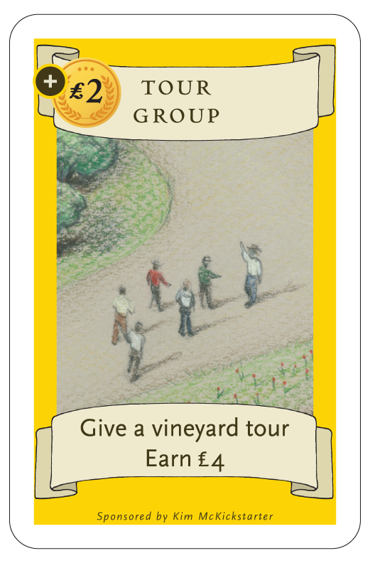 Here’s the original card frame for summer visitor cards. Not so good, right?
Here’s what the final summer visitor card frames looked like after my graphic designer worked on them. There’s more texture to the frame.
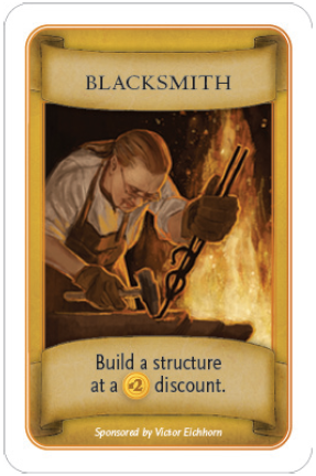
However, here’s something I learned over the last year: For a truly great card frame, you need to combine the efforts of a graphic designer and an illustrator. Sometimes they’re the same person; sometimes they’re not. See the following:
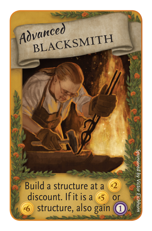
This is the result of my graphic designer, Christine Bielke, collaborating with my artist, Beth Sobel, to create card frames for the advanced visitor cards in Tuscany.
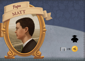
Here’s another example from Tuscany from artist Dann May. I would say that Dann is one of the premier card frame artists out there (he does much more than card frames too). This is a papa card:
The takeaway? Hire a professional illustrator and designer to create a truly beautiful, functional card frame. It will be some of the best pre-Kickstarter money you spend.
What are some of your favorite card frames in games?
47 Comments on “Kickstarter Lesson #85: Card Frames”
Leave a Comment
If you ask a question about a specific card or ability, please type the exact text in your comment to help facilitate a speedy and precise answer.
Your comment may take a few minutes to publish. Antagonistic, rude, or degrading comments will be removed. Thank you.
just want to aks, why there is this white frame on card so often ? is this necessery, does it have to be white ?
It doesn’t have to be white, though black borders more easily show wear and tear than white edges
Thanks for sharing all the knowledge
Hi Jamey – thanks for this post. One challenge with frames is that if printing isn’t 100% accurate, the borders can betray those manufacturing mishaps more than a full-bleed card would. I’m building a game based on photo cards (think polariod-esque) and want slim white borders so that images don’t bleed into one another. But I simply can’t have borders that are misaligned AT ALL. Advice for printing, or a recommendation for printer who can handle this exactness? Thanks in advance!
Paul: Panda can handle this–they’re doing something like that for us now.
Whoa – potentially the fastest reply ever on a five-year-old post. Thanks!
We’ve received comparable quotes from both Panda and Admagic. Thanks for pointing us in the right direction Jamey. Do you have a strong preference of one vs the other? I’d rather pay a bit more to have superior quality.
I can’t speak about AdMagic, but I can say that I only work with Panda because they’re awesome in so many ways.
I was wondering what people’s view on flavour text is. Our game doesn’t need much apart from the images but we are thinking of flavour text to add to the humour of the experience. (the game is funny) any thoughts?
As an illustrator, I would say that I like the 3rd card best, namely because my eyes dance around the entire card. That being said, I would probably have done different type for the “advanced blacksmith” as it does take away from the overall look. I know this game has been it for several years now, and it came out nicely!
-Jessi
In the context of a discussion about Kickstarter, I think most non-designers would respond stronger to card 3. While it has issues it is lavish, like an over-wrought minature. It says ‘quality’ to them. I don’t know it I would be so kickstarter-centric as to design for that audience but card 1 looks basic, almost placeholdery. The farther you move from that the more it will look like you’ve spent time, money, and talent on art.
I think the 3rd card looks better but it still has problems at the bottom. The bottom is cluttered and messy. the rest of the card looks fantastic. If the vines stopped before the end, and it was just the same and color there would be more breathing room.
The process probably would have gone better in 3 rounds. Designer for layout skeleton (blank shapes and text), artist to add fancy beautiful elements, designer to clean up and have final say.
Thanks Jamey. And thanks for the site in general. I’m learning so much about KS!
Jamey, would you recommend getting a Graphic designer to create the frame, and then fill in the text yourself, or get the graphic artist to place the text as well? I’ve got an illustrator lined up. I’m searching for graphic designers, but lordy they’re expensive! Cheers.
Dan: I would recommend getting a graphic designer and an illustrator/artist to collaborate on a frame, then have a graphic designer typeset the cards. It’s worth the expense.
Very relevant post for us atm. We have a great illustrator, but are currently looking for a great graphic designer for our card borders and eventually our box, rules, etc. (We know some, but I’m not sure how much overlap there is between graphic design for digital games and board games.) Dann May’s work looks great! We’ll be reaching out to him, and I’ll be sure to let him know how we found him. Thanks!
One question: any particular reason you decided to go with white borders rather than borderless (or black borders) on your cards?
eddyboxx: Good question about borders. One reason we went with borders is that you have a greater margin of error when it comes to cutting the cards. If they’re a little off, the cards still look fine, while if the art goes all the way to the edge, you could end up cutting off a little bit of the art. Every manufacturer tries to prevent this, but it happens from time to time.
If we were to make a game where the cards needed to lay side by side to form some sort of cohesive picture (like Tokaido), we would print the art all the way to the edges. Or if my graphic designer ever thought it made sense for the game.
As a graphic designer I would say while many cards would benefit from frames it is not a must and you need to ensure that your product is right for it. You may find that the art looks completed without any frames at all or a half frame as in the case of the card you are showing with the vine boarder. I have designed cards both ways. I think it is important to remember the theme and concept of the game as well. it may be very fitting to not have frames at all.
Jason: That’s actually a good point, so I should clarify. For example, the Marvel Deckbuilder cards don’t have a frame, but they do have a very intentionally designed card layout. So I would say the card frame and/or layout is the key takeaway here.
The 7 Wonders card design evolution would be a better example, in my opinion. I love how the card design got out of the way and ended up with clean iconography, with great design flourishes that blend into the background.
Note how the cards are clear, consistent, and beautiful. (Not crowded at all)
Echoing other folk here, #2 is the cleanest design, but #3 has some artistic flair that could be incorporated in #2. #3, however, is too busy and crowded.
I am afraid I do not like the third one either. It is a bit too clogged for my taste. In fact, I don’t want to be pedantic, but I think that the designs you consider are a bit 20-th century.
Have you looked at the full bleed promotional cards from FFG? Take a look at https://www.fantasyflightgames.com/ffg_content/organized-play/game-night-kits/Season-3-2013/adonis-campaign.png
I wish they did ALL their cards like that (not only promotional ones). If/when I get to print my game it will be like this! :)
[…] Kickstarter Lesson #85: Card Frames – Stonemaier Games […]
Well, for me the art on the cards isn’t all that important as I’m not very likely to even notice its there, so as long as it predominantly uses text instead of trying to hide everything behind icons I’m happy! ;)
Having said that, I like the vines on the 3rd card as a way to differentiate between the original and newer cards, it’s a nice touch and far better than what you could have got away with of just using the fact they’re all titled ‘advanced’ to tell them apart. The biggest issue I see with it is how much of the yellow it covers up, making it harder to see that it’s a card to play in summer only, and if the winter cards also have the same vines I imagine many people getting them confused.
Thanks Chris! The winter cards have vines with berries. I really haven’t found it to be an issue when holding cards in hand, but I’ll pay careful attention to it during the next playtest.
Nik: That’s a great point about polling for backer input. I generally pick and choose the things that I’ll ask for input on–not everything is up for the crowd to decide (if it were, it would be impossible to stay on schedule!)
Haha, not intending to critique your specific game, but as those were the only cards used in your example for the blog… I have to admit as graphic designer, illustrator and a fine artist myself, I like the second card more as well. The main reason isn’t necessarily about any specific item, but that it is too cluttered. The focal point is missing in the third card. It’s enhanced by the fact that everything on the card is warm yellows, oranges and browns and then has an abundance of green standing out, the only thing I look at is the vines. Looking at the elements themselves they each look great, and it looks like a lot of time was put into it. And if I hadn’t seen the other renditions, I’m sure I’d have no initial reaction and think it looked great. :P Maybe the lesson to this lesson is that you need to start with a good foundation, and then ask your audience what they like. I’ve been in a few kickstarters that have put forward 2-6 designs and put aside their own opinion to ask the backers what their favorite was. I really enjoyed that, and felt that I was more of a part of the process. Granted, even with that, you are still putting forth your best materials, so the outcome is still one that sits fine with you. You know how backers love to tell you their opinion. ;)
I like to share this one too because the development of a card is always interesting.
This BGG image shows the card design development for 7 Wonders:
https://boardgamegeek.com/image/781807/7-wonders?size=large
That’s awesome! I need to study that for tips. :)
My key point was just that a number of considerations contribute to a good frame (publisher, designer, and the art team working together). I am totally on board with your point about it being worthwhile to make the investment in quality card frames.
You mentioned you wanted examples of our favorite card frames and I wanted to pull something together for an upcoming game from Clever Mojo Games called King’s Forge. I’ve been so impressed by these and, as a backer, I’ve watched them develop and grow from draft to finished frame. The illustrator is Jonathan Kirtz and I’m sorry to say I don’t know who is doing the graphic design — but I love the frames and even the card backs.
https://www.dropbox.com/s/xnmi1pviwqifor9/kingsforgecards.jpg
The ones with the wood grain are meant to be posted announcements by the King and the ornate purple with the silver are for an expansion deck celebrating the Queen. The announcement approach adds to the underlying narrative feel and the details on the Queen’s cards are top class. It makes such a difference to have well-framed cards.
Very nice, Chris! I like the look of those cards a lot, and I like how the card frame plays into the narrative, as you said. I’m a backer of King’s Forge, so I’m looking forward to getting the game, especially with frames like those.
I appreciate all of your opinions! Although I didn’t intend this entry to be a place to critique Tuscany, this is a good warm-up for the Kickstarter. :)
Chris, we’re not required to put sponsorship on the advanced visitor cards. And yes, we certainly try to keep the amount of text in consideration when we design cards. I try to keep it to 2 lines, but sometimes 3 are needed.
Part of the reason we added some new elements to the advance visitor card frame is to distinguish them at a quick glance from original visitors.
I haven’t seen the rules yet so this is just speculation, but is it really necessary to distinguish them easily? I like the new frame, but it’s so different from the old one (different title orientation, ability on a recessed frame instead of on a ribbon) that I feel it could be a bit weird to hold both kinds in your hand if they have no special rules apart from the abilities written on the card.
If the distinction is only needed if you want to remove the expansion from the deck after playing. In this case a small icon on a corner, as several other games do, would work almost as well (or perhaps even better, it might be easier for the brain to process); or you could make a few changes such as adding the vines, but keep the original ribbons for consistency.
(BTW, I recently was on the fence on whether I should back a game on Kickstarter and the card frame was a big reason I decided not to; it just felt amateurish, which didn’t give me much confidence in the game.)
Davi: Yeah, it’s pretty important to be able to separate the advanced and regular visitors, both in terms of sorting them (they have the same back) and in the game. We considered the icon idea–it’s a good one–but honestly, I really like the frame, and I don’t think it detracts from the playability and functionality of it. I’ve played with the cards a lot, and I hardly even notice the new frames except when I’m looking for them, which is the right time for them to be apparent. :)
I agree with DayInDaLife that Advanced Blacksmith is potentially over designed. But not because I don’t like the art, it’s too much text for that box (it’s hard to compare the two cards directly because they have different content). I will come down in “camp 2.5” for now because 2 is a coherent whole and 3 still needs work.
I do recognize there is positive development between 2 and 3 (e.g. the new banner heading and ivy detailing are lovely), but that Advanced italic font is a poor choice. Also, the L symbol is too small in front of the number and should be unnecessary if you have established that the yellow coin shape means money. What are more common concerns than color-blind issues, basic vision and people with glasses. We need to be nice to older eyes too.
Jamey, are you required to maintain the sponsorship on such a small card even though it’s a new card effect? That’s a case where the businessman is working counter to the designer. In general, I think Advanced Blacksmith needs more air because you are asking it to do too much. Lately I have been watching the Alien Frontier’s new alien tech cards for a promo be strangled by too much text and intent. Mixing icons and text asks for more space in my opinion.
Whether you agree with my differing opinions isn’t important of course, but clearly the publisher, the game designer, and the art direction are all counting on each other to make each other’s job easier. They all make huge contributions to game immediacy and elegance. If you give designers enough space, they’ll make it work—but content editing is a huge consideration in my opinion.
I partially agree with DayinDaLife. Card 3 is nicer overall, but some of the rigid form is lost, which makes it appear less clean. It took me much longer to take in Card 3 because of the other design elements. For instance I looked at the sides to see if those plants had any sort of game information. It seems silly, but I might even compare two cards with two plant patterns and try to discern if the number of flowers are some kind of indicator for the value of the cards. This is how a lot of super analytical people link, which are often the types you find drawn to these kinds of board games. Many other games do this and what I’ve found is that cards that are prettier but have a less rigid, easy to absorb format just take a little getting used to. By your second or third game, you’ll be able to quickly look at them and get the information you need. It’s also somewhat of an unfair comparison because Card 3 does have more information than Card 2.
Dann May did all the card frames (and card backs) for our game as well, and they are gorgeous. We never would have thought to incorporate so many thematic elements into the card frames themselves and it makes all the difference. Great recommendation Jamey!
Well, I will admit I am very picky. Being a graphic designer myself, I tend to be very critical of graphic design (even my own). But I LOVE the third pic, so glad you changed it!
Ha ha…thanks Jeff. :) We’re always trying to improve! (And I’m not a graphic designer, so I have to trust my creative team.)
Yup, I’m with card three. I get that it’s busier than card 2. But I also find that my eye goes more quickly to the info…on the second card, there’s so much sameness of color that I rely on convention rather than design for where to look. Plus it’s preeety.
I would have to disagree with DayinDaLife. I know we all have our opinions and I can respect that opinion. But my initial reaction on seeing the 2nd card image in the set of 3 was “Really, that’s FINAL art? I wouldn’t buy a game with cards that looked like that”. But then when I saw the 3rd, I thought, “Now that’s a card I can get behind!” Much better looking the third time around!
Thanks? That is actually the final Blacksmith card that went into Viticulture. :)
The problem with illustrators / artists is that they do not have the same understanding of “cleanness” in the way gfx designers do. I think your 3 cards is a perfect example. The 2nd card is the best card by kilometres, there is no contest here. The 2nd is clean, functional and pretty, while the 1st is in need of obvious tweaking, and the 3rd is a classic example of what happens when a artist gets involved in card or game board design. They fill it up with arguably nice looking art, but it also clutters the image and makes the cards less pretty and functional. Even though there is nice things to look at the very fact there IS other things to look at clutters the card and makes it less pretty even if there is more complex art on the card. The 3rd card is over designed.
That’s an interesting perspective. Obviously I think the third version is the best (as do my artist and graphic designer), but you’re welcome to your opinion. :)
As a graphic designer, I’ll also chime in here and agree that the third card is a bit over-done. Parts of it are definitely an improvement, but there are some critical spacing/padding/alignment mistakes being made, and the word “Advanced” really doesn’t gel with the rest of the card layout. It does indeed look to my eye that a non-designer artist got involved too heavily.
I couldn’t agree more. As someone with an appreciation for graphic design, I think that the second card is fantastic, whereas the third is just a bit much. The vines didn’t really need to be on the edges, and the fact that the scroll is lopsided is bugging me quite a bit. I’m also not a fan of two different typefaces being used in a somewhat haphazard manner.
I do, however, know that my personal aesthetic is minimalistic with clean, crisp lines, and that’s not the same for everyone. As long as the game is good, I’m gonna back it. :)
I like the second more too. I guess “Less is more” applies to this as well
As a graphic designer, and Art Director, I agree completely, with this critique, – 2nd is a clean design