I spend a lot of time thinking about the impact of images. When I’m scrolling through Instagram, Facebook, or YouTube, which images make me pause? When I hear about a new game, book, or movie, which images draw me in? And when I land on a Kickstarter or Gamefound page, which image at the top of the page entices me to learn more?
A quick related aside before I get to the main topic: One of the things I really appreciate about Tim Chuon’s photography is that he offers studio photos and lifestyle images. I typically share both–as I’ve been doing in recent design diary posts about Tapestry: Arts & Architecture–but I’m fascinated that both types of images are powerful in different ways.
Here are two related images: Which one are you more intrigued to click on first?
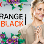
In the comments of a recent post about game box sides, alert reader Stefan shared a fascinating article about different images tested by Netflix.
In the article, a number of different thumbnail images are shown for various TV shows, with green arrows pointing to the image that garnered the most engagement. I’ll share a few of the images and a quick summary of Netflix’s analysis, but I highly recommend the full article.
Feel free to guess why these images worked before seeing Netflix’s theory below.
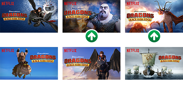
Netflix found that prominently displayed villainous characters performed far better than the other images. I wonder if this is similar to observations from YouTubers that negative-sounding titles seem to generate more clicks (though not from me personally–those are the videos I avoid).
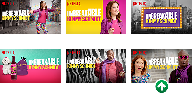
Netflix found that images with faces–expressive faces in particular–resulted in more engagement than the others. It would also seem to me (based on the “winner” above) that having multiple people expressing different emotions works best. I can relate to this with certain people on YouTube, like the contagious enthusiasm found in Punchboard Party’s videos.
To continue the idea of one person vs several, Netflix found that an image containing 4+ people was less likely to be clicked on than 1-3 people. I think this is partially due to the small size of the images–you can’t see the details on anyone’s face on the more crowded image.
Though I think it carries over to most format, perhaps related to the paradigm of choice: When I see an image that focuses on one or two games (or aspects of a game), I’m more compelled to dig a little deeper because I’m informed up front that this will be a focused discussion instead of one that spends a little time on a lot of different topics. A corollary is the Wingspan box–I chose a single bird for the box top, not a dozen birds.
There’s more to the article than this, so feel free to check it out here. I’d love to hear your theories about why these images work and any parallels to other media.
***
Also read:
- What’s the Most Eye-Catching Format for YouTube Thumbnail Images?
- The Main Project Image (KS Lesson #160)
If you gain value from the 100 articles Jamey publishes on his blog each year, please consider championing this content!
4 Comments on “Villains Result in Clicks (and Other Insights from Thumbnail Images)”
Leave a Comment
If you ask a question about a specific card or ability, please type the exact text in your comment to help facilitate a speedy and precise answer.
Your comment may take a few minutes to publish. Antagonistic, rude, or degrading comments will be removed. Thank you.

[…] all of the images to distinguish it from the KS ads that often show up on BGG. I was inspired by Jamey’s Netflix blog post from a few months ago which talked about the fact that different people react to (and therefore […]
I’m probably in the minority here since these kinds of thumbnails are all over the place and seem to be performing very well, but all of those thumbnails with exaggerated expressions scream fake to me. I avoid those because I feel like they’re trying to trick me into viewing their content that is probably not as good as they want me to believe.
That was really interesting. Board game boxes can look as small when browsing bgg or in facebook images of the game in play with the box in the background. Before I read the conclusions I thought close up of a face, less clutter, and good background contrast is the best structure. Lots of older board games have one person on the cover.
With the second failed pic of Kimmy it’s also one person and a close up but it was not the winner because she doesn’t standout against the background (purple on purple, no contrast). The zebra one is similar (the background is too distracting).
I wonder if the villainous conclusion is invalid tough. I cannot make out the hero faces, and there are more than one character/object to focus on. The hero images fail regardless. With just those 6 test images it’s not fair to conclude villains do better. I’d like to see tests done with pics of one hero close up with a background that is not distracting vs those well structured villain pics.
I agree with Gerald and am inclined to believe that the two villain images may have done better more because the faces are more clear than because they are villains.